
ZONE GROUP:
Space, Defined
A Brand Identity Built on Structure, Restraint and Long-Term Value
ZONE GROUP is a property developer based in Bahrain. It brings architecture, interiors, project management and construction under one roof, and its housing arm, Zone Housing, builds under a simple promise: building a better space.

Our services
- Brand Identity
- Logo Design
- Visual System
- Typography
- Corporate Profile
The Context
Bahrain's property market asks investors and families to make the largest financial decision of their lives, often through renderings that are loud and promises that are louder. Trust is the real product, and it is built on clarity.
ZONE GROUP works across the whole life of a building: master planning and urban design, architectural and interior design, cost planning, project management and construction. Through Zone Housing it also develops six villa models for modern housing, and it holds a clear belief about how to build: Global Designers, Local Build!
That breadth is a strength, but it can look scattered from the outside. A brand with many services and one message needs a system, not a collection of parts.

The Challenge
How does a developer look established and modern at the same time, and speak to two audiences at once?
Investors want structure, proof and long-term value. Families want light, warmth and a place to imagine their lives. One identity had to earn both kinds of trust, across a corporate profile, a housing brand and a group of services, without raising its voice.
Strategy
We summarized the ambition in one sentence: space, defined.
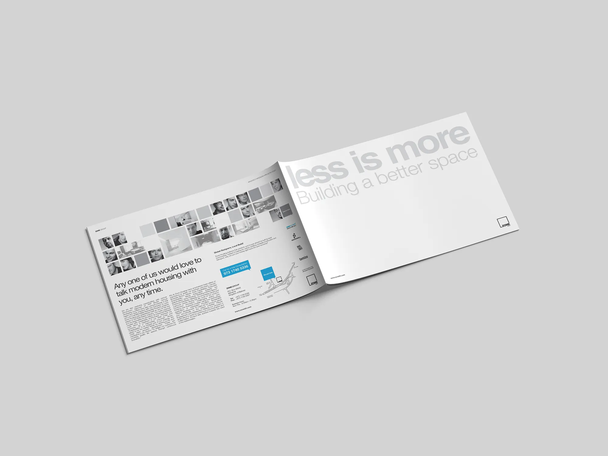
A zone is a defined area, and defined space is exactly what a developer delivers. The group's own philosophy, less is more, was already in place. We turned it from a slogan into a rule: every element in the identity has to earn its place.
That rule matters most in a category crowded with ornament, gloss and visual noise, because clarity is what signals confidence. By reducing what the brand shows, we increased what it says. The result is an identity that speaks to investors as rigour and to families as calm, and does both with the same few elements.
Design
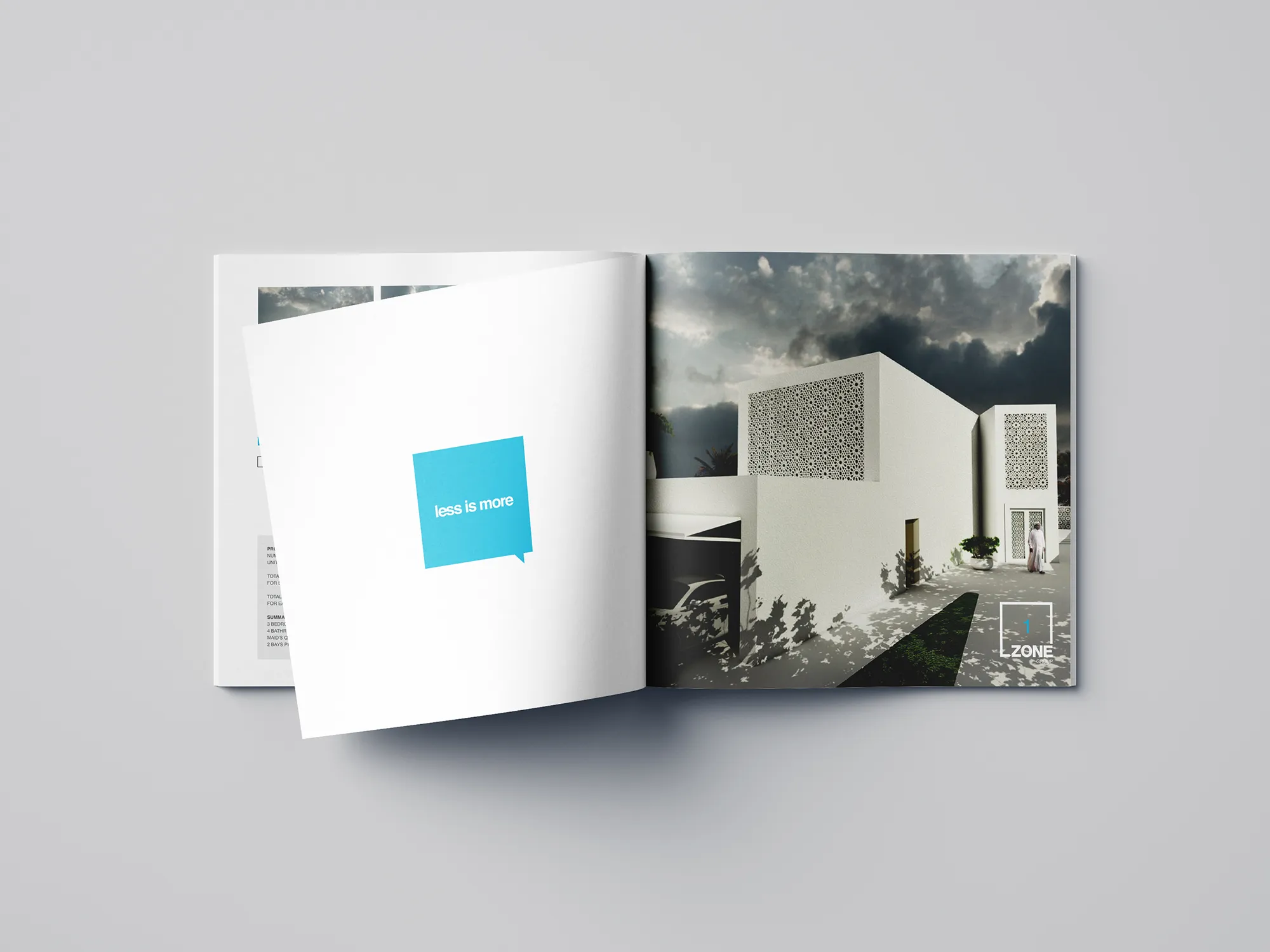
The mark is a square frame that holds the name. It draws a boundary, which is what a plot, a room and a property are. Inside the frame, a numeral in an accent color identifies each housing model, so the logo itself becomes the system's counting unit.
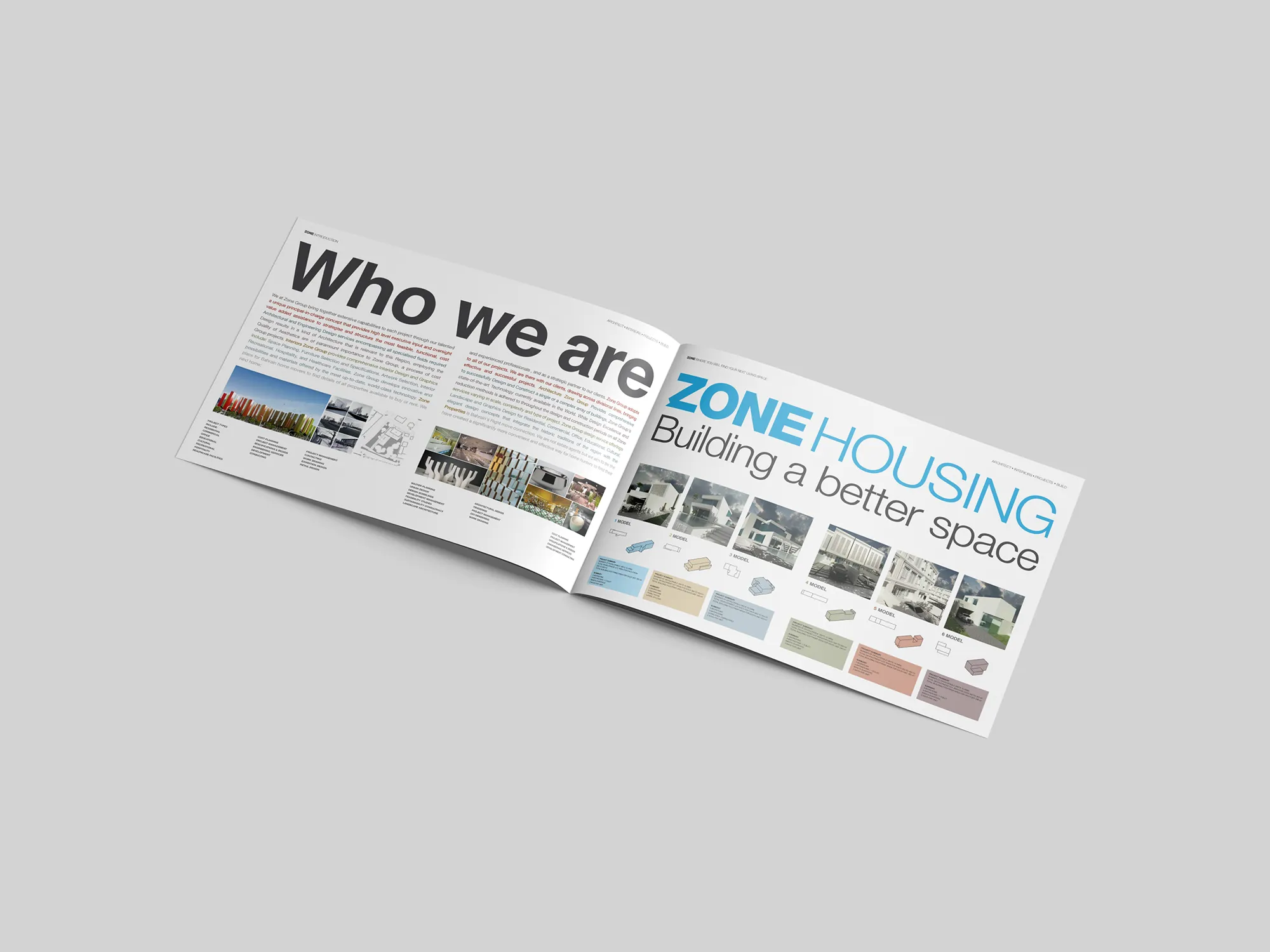
Typography uses a single neutral grotesque at two extremes, heavy and light. Headlines run at monumental scale, and weight carries the hierarchy, as in the bold ZONE beside the light HOUSING. There are no decorative typefaces and no extra fonts, so the page stays quiet and the message stays clear.
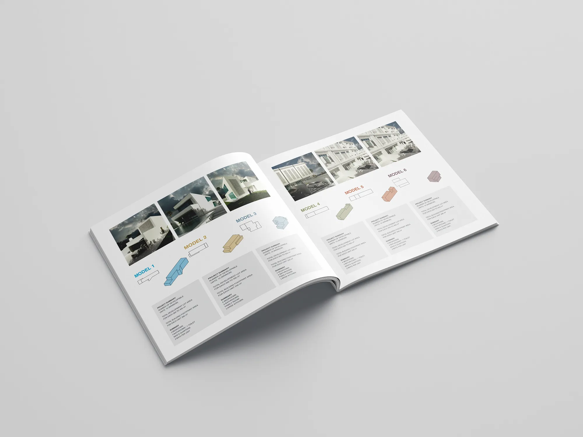
Color is graphite grey and generous white, with six muted hues assigned to the six housing models: cyan, sand, slate, olive, terracotta and plum. Color is information, not decoration. A reader can recognise a model before reading its name, and the same color carries through its plan, its summary and its numeral.
The “less is more” square, a colored block with a small tail, works as a signature: a block that speaks. It closes each model's section and appears in the corporate profile as a quiet punctuation mark.
The portrait grid shows the team as a mosaic of black-and-white faces mixed with interiors and a single colored square. The group reads as designers who are ready to talk, in line with the profile's own invitation.
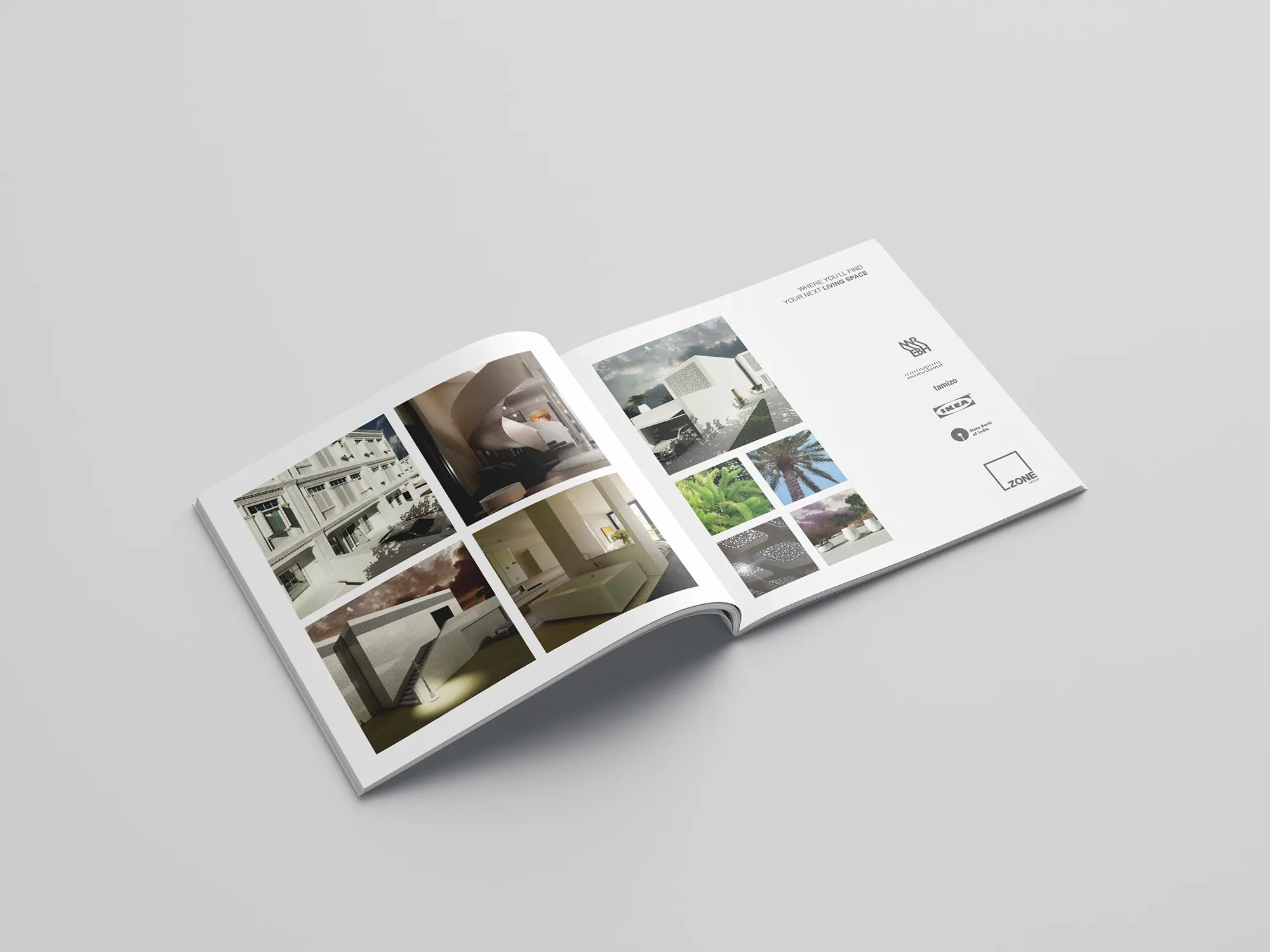
Space is treated as a design material. Margins are wide and consistent, images sit on a strict modular grid, and every page leaves room to breathe, so the identity practises the restraint it promises.


Want the full picture? Download the ZONE GROUP Company Profile and the ZONE ONE Profile.
The Voice
ZONE GROUP speaks plainly and invites rather than pitches: Building a better space. Any one of us would love to talk modern housing with you, any time.
Sentences are short, the warmth is human, and there is no jargon. The tone avoids superlatives and any adjective that a building would have to prove. It sounds like a professional who is confident enough to be simple, and it gives every page the same calm authority.
Results
The identity clearly expresses what ZONE GROUP stands for. Investors and end clients understand at a glance, before reading a single paragraph, that this is a professional, structured developer with long-term value in mind.
Consistency is visible across the logo and the corporate profile. The frame, the type and the colors behave by simple rules, so every new page, brochure and proposal looks like it comes from the same hand. The system also gives the group room to grow, since a new model, service or document can join without breaking the whole.
 Next projectRH Holdings→Structure That Compounds.
Have a project in mind?
Let’s talk about it.
Say hello