

Olive Tree:
Rooted in Refinement
A Visual Identity Built on Quiet Luxury, Grown to Last
Olive Tree is a Saudi real estate developer building villas and premium environments defined by restraint, elegant without excess, warm without losing precision. We built its identity from a single symbol, the olive tree itself, and carried it with discipline across every application a client, partner or resident would ever see.

Our services
- Brand Strategy
- Visual Identity System
- Logo Design
- Brand Guidelines
- Business Collateral
- Social Media Kit
- Signage
- Brand Applications
The Context
Saudi Arabia's premium real estate market is crowded with brands reaching for the same signals of luxury: gold accents, dramatic imagery, grand claims. Olive Tree needed to stand apart not by shouting louder, but by feeling more considered. The olive tree itself, a symbol of permanence, groundedness and quiet abundance, gave us the starting point for a brand built on the same values the developer builds into its properties.

The Challenge
The challenge was translating a single, deeply symbolic mark into a full working identity system, one that could appear as a delicate line illustration on a business card, a bold pattern across a hotel corridor, and a small circular icon on an Instagram profile, without ever losing coherence. The brand also needed to work bilingually from day one, in English and Arabic, across markets where both languages carry equal weight.
Strategy
We positioned Olive Tree around a single idea: rooted luxury. Not luxury as spectacle, but luxury as something grown, cultivated and lasting, the same qualities buyers look for in a home meant to hold a family for generations. Every strategic decision, from tone of voice to color palette, was built to reinforce permanence, quality and quiet exclusivity rather than trend-driven glamour.


Design
At the center of the identity is a hand-illustrated olive tree mark, rendered with fine, organic linework that reads as crafted rather than corporate. The wordmark pairs a refined serif for “olive tree” in English with a matching Arabic script, giving both languages equal visual weight and equal elegance.
The palette anchors the brand in a deep forest green, paired with a warm metallic gold and soft sage and cream tones drawn from the olive tree itself, bark, leaf and fruit translated into a full color system. This palette carries consistently from the deep green sign board and business card to the lighter sage and cream social media templates, giving the brand range without losing identity.
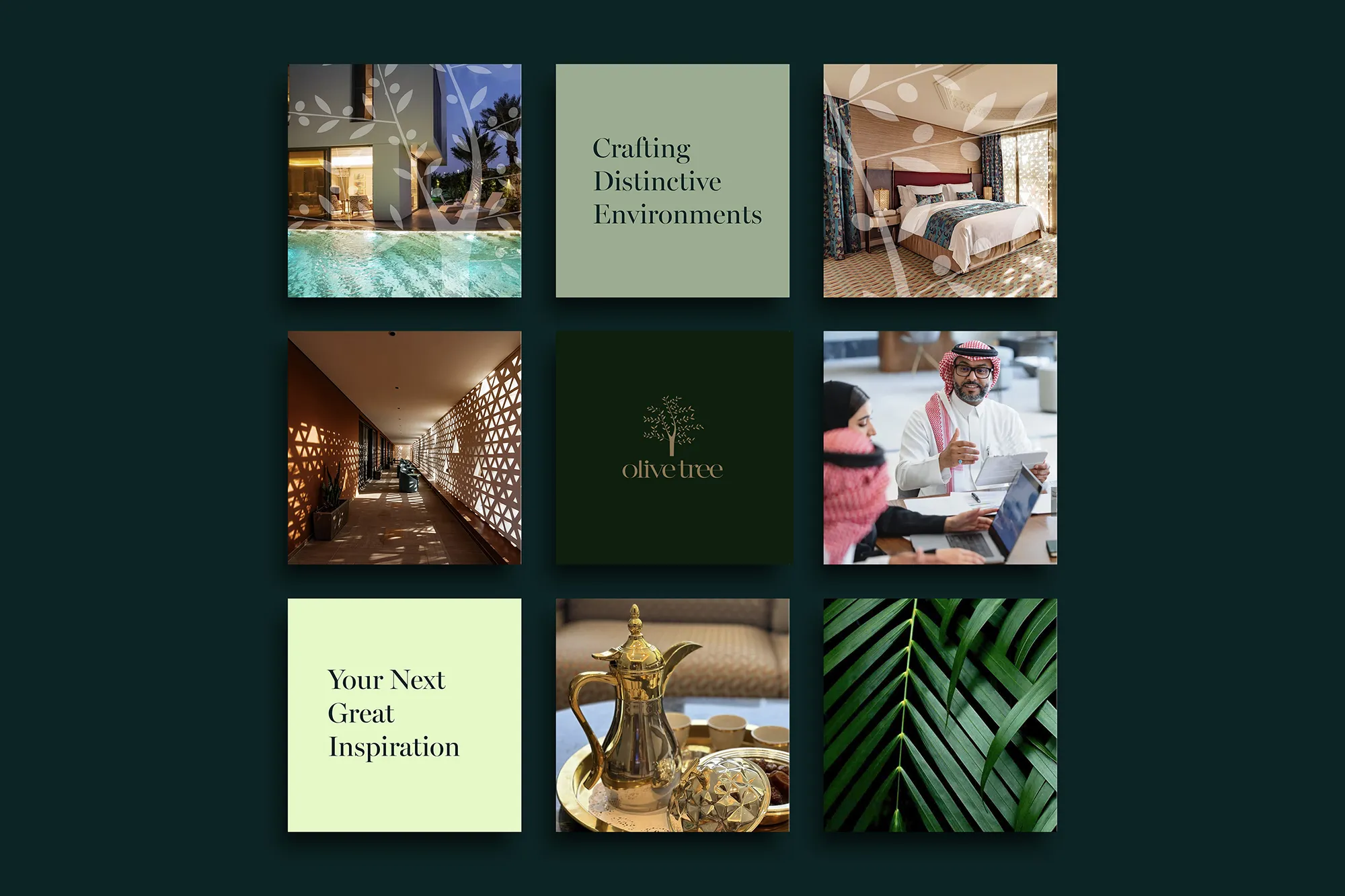
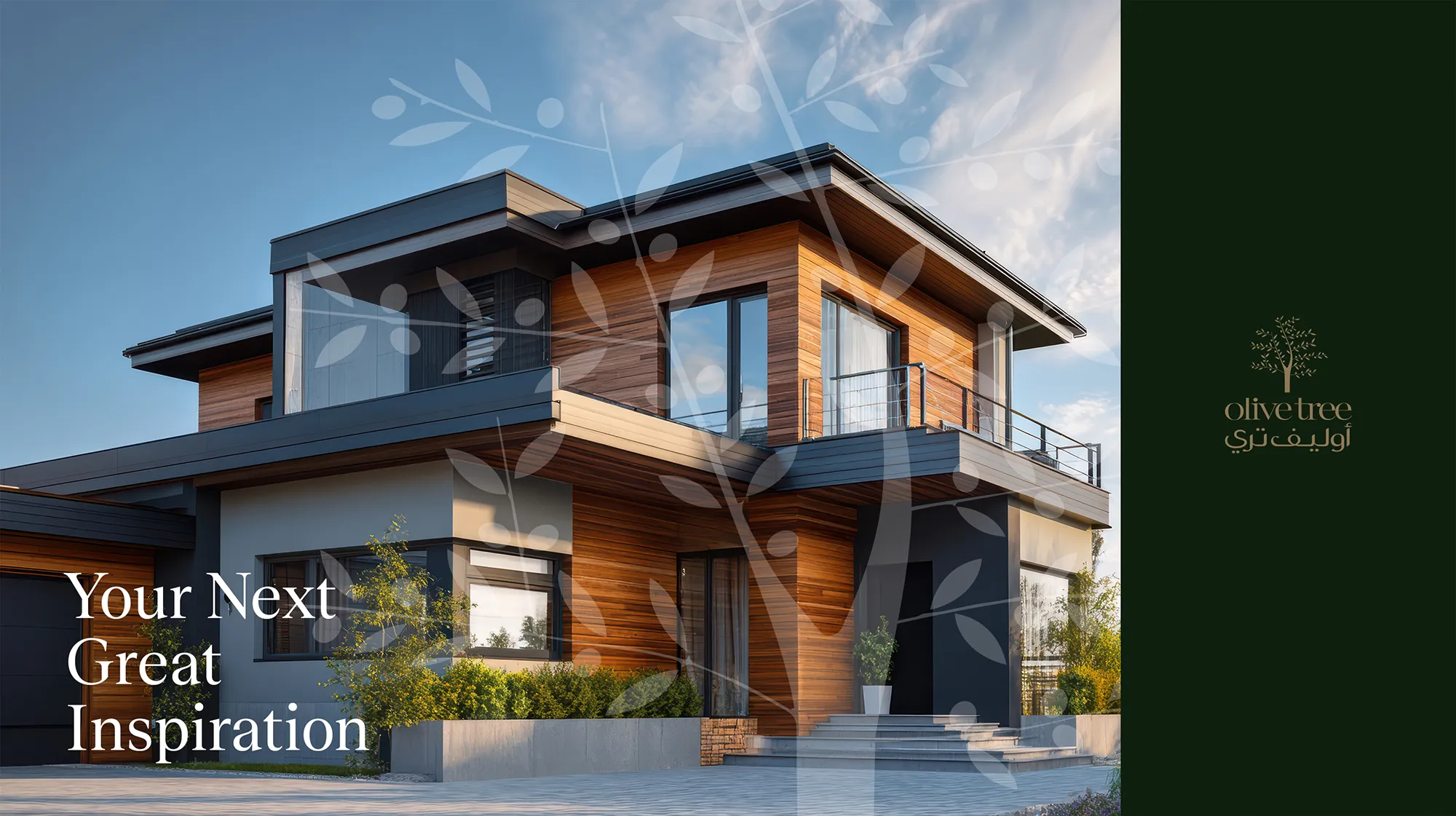
An olive-branch pattern, built from the same linework as the primary mark, extends the brand across large surfaces: overlaid on architectural photography, wrapped around interior corridors, and printed across the full page of the letterhead's reverse side, turning a supporting element into a signature texture in its own right.

The Voice
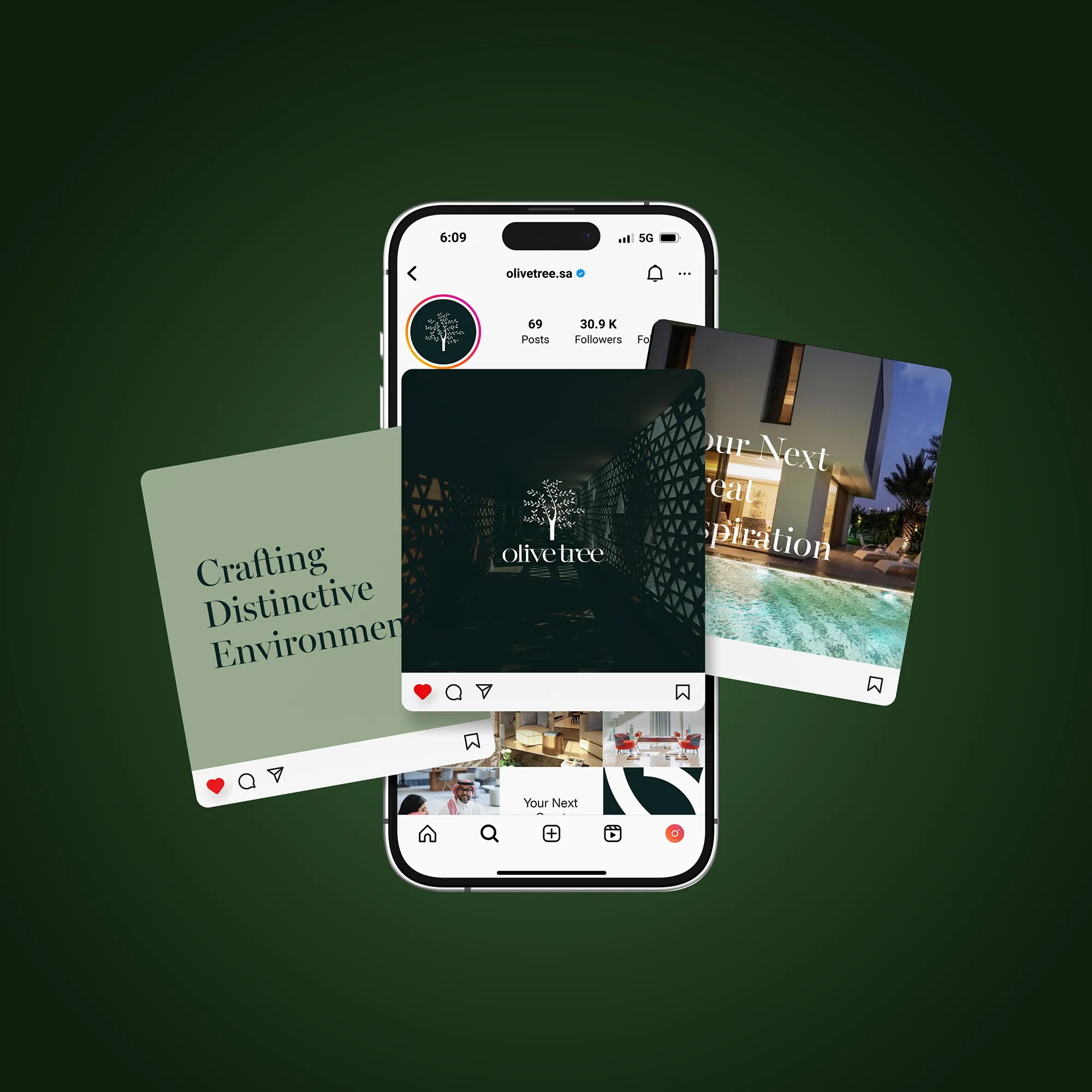
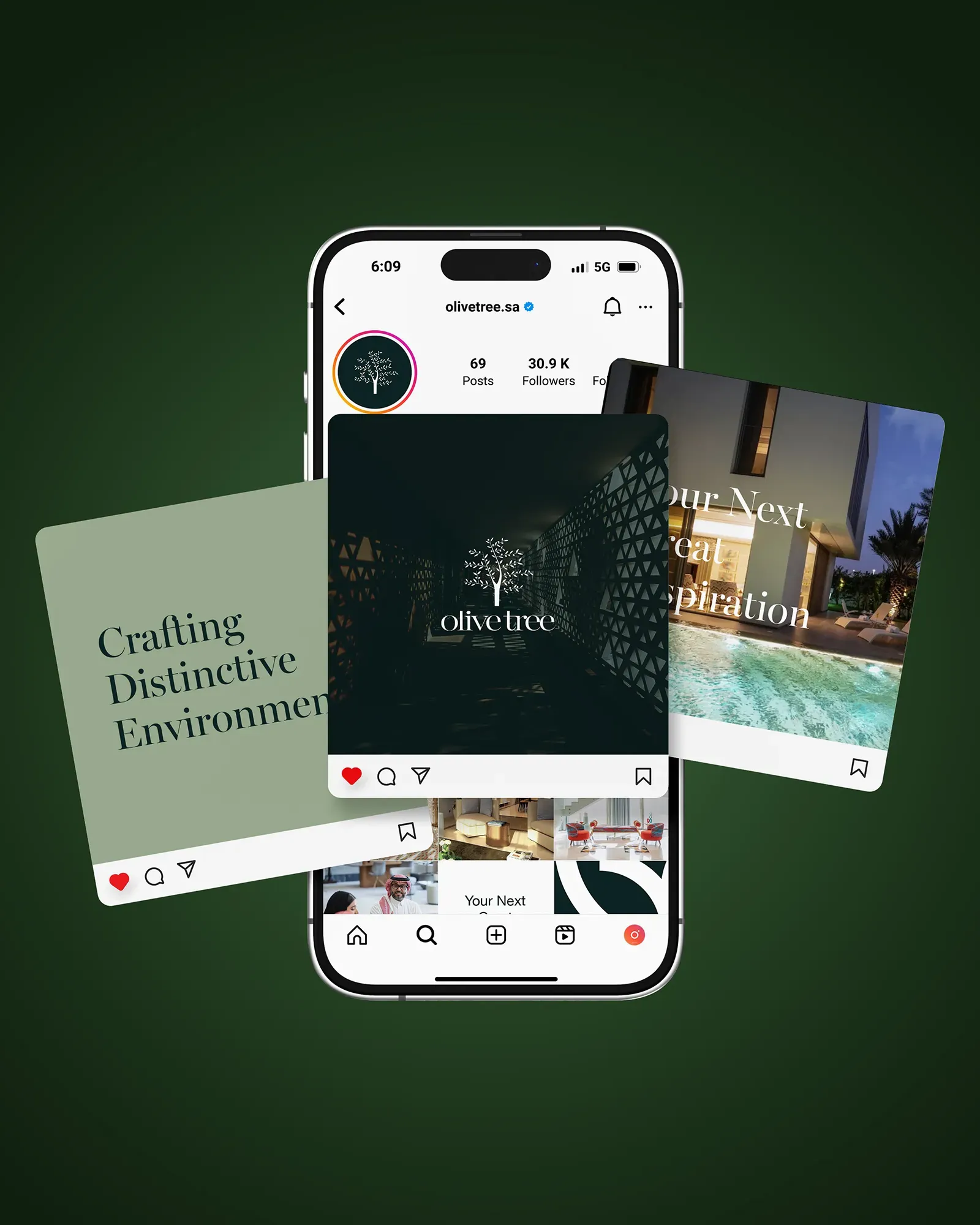
Olive Tree's voice speaks in short, confident lines: “Crafting Distinctive Environments,” “Your Next Great Inspiration,” “Inspired Living by Excellence.” The tone stays warm and aspirational without becoming ornate, letting the visual system carry the sense of luxury while the words stay clear and direct, in both English and Arabic.
Results
The result is a complete brand application system spanning business cards, letterhead, email signature, exterior signage, and a full social media kit, LinkedIn, Twitter and Instagram profiles, covers, app icons and post templates, all built from one disciplined visual language. Whether a client encounters Olive Tree on a sign board, a business card or an Instagram post, the experience feels like the same brand: grounded, refined and unmistakably its own.
 Next projectKafa'at Recruitment→Talent, Framed.
Have a project in mind?
Let’s talk about it.
Say hello