
Kafa'at Recruitment:
Talent, Framed
A Rebrand Built on Reliability, Professionalism and Lasting Partnership
Kafa'at Recruitment is a professional recruitment company in Saudi Arabia, offering executive search and consulting. Its work is people, and its market runs on trust.

Our services
- Brand Identity
- Logo Redesign
- Brand Guidelines
- Stationery
- Digital Applications
The Context
Recruitment is a business of introductions. An employer hands over a decision that will shape a team for years, and a candidate hands over a career. Both judge the firm long before they judge the shortlist, and they judge by what they can see: how clear it looks and how credible it feels.
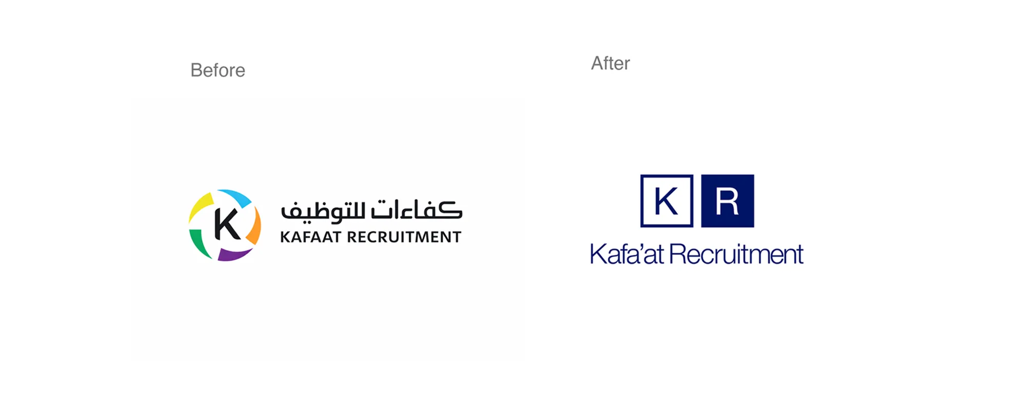
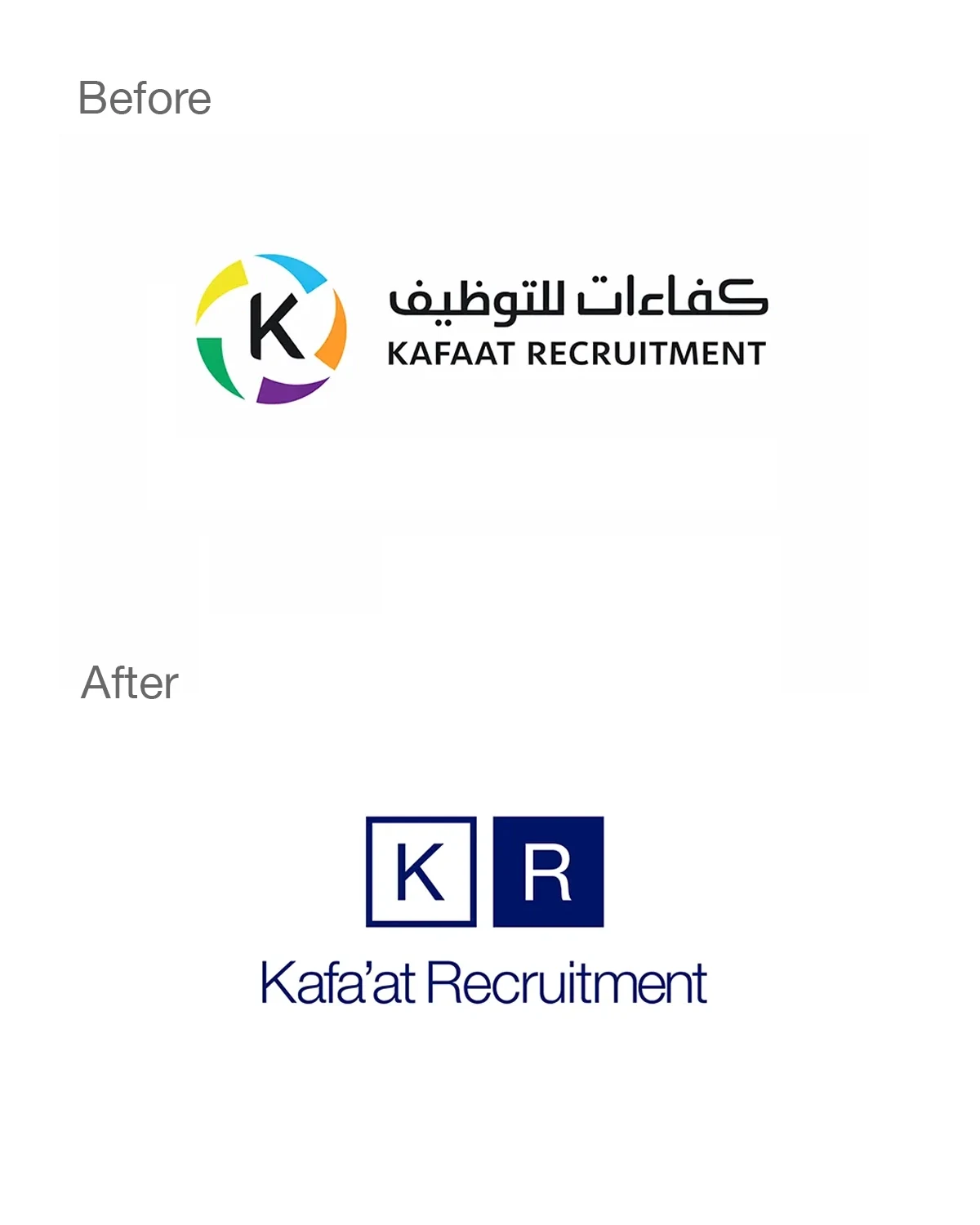
Kafa'at's earlier identity used a circular emblem in five colors, yellow, blue, green, purple and orange, beside a name set in Arabic and capital Latin letters. It carried energy, but a firm that advises at executive level needed a steadier voice, and a mark that would reproduce cleanly in a single color on a card, a document or a small profile picture.
The Challenge
How does a recruitment firm look reliable and modern at the same time, in two languages?
Employers want a partner with structure. Candidates want a firm that treats them with respect. The identity had to earn both, simplify what came before, and hold its shape in every setting, from a printed card to a small round avatar. Arabic and English also needed equal presence, since the firm's clients and candidates read both.

Strategy
Our positioning came down to two words: talent, framed.
A recruiter's craft is framing: seeing the right person, presenting them clearly and placing them where they will thrive. We gave the brand the same discipline. Instead of adding, we simplified: one monogram, one color and one framing device, applied with the same care everywhere.
The firm also sells long relationships, so the identity is built from pairs: two letters, two scripts, two sides of a card. Partnership is designed into the system, and it is not only written about it.


Design
The monogram pairs the firm's initials in two squares: the K inside an outlined square, the R reversed out of a solid one. Open beside filled, they read as a pair, the way a firm and its client do. Two squares are the simplest structure there is, and it holds at any scale, from a mark on the back of a card to a round avatar on a social profile.
The lockup places the Arabic name above the English name, matched in weight and set in the same calm blue, so neither language leads. The English name moves from capitals to title case, and its apostrophe reflects the hamza of the Arabic original.
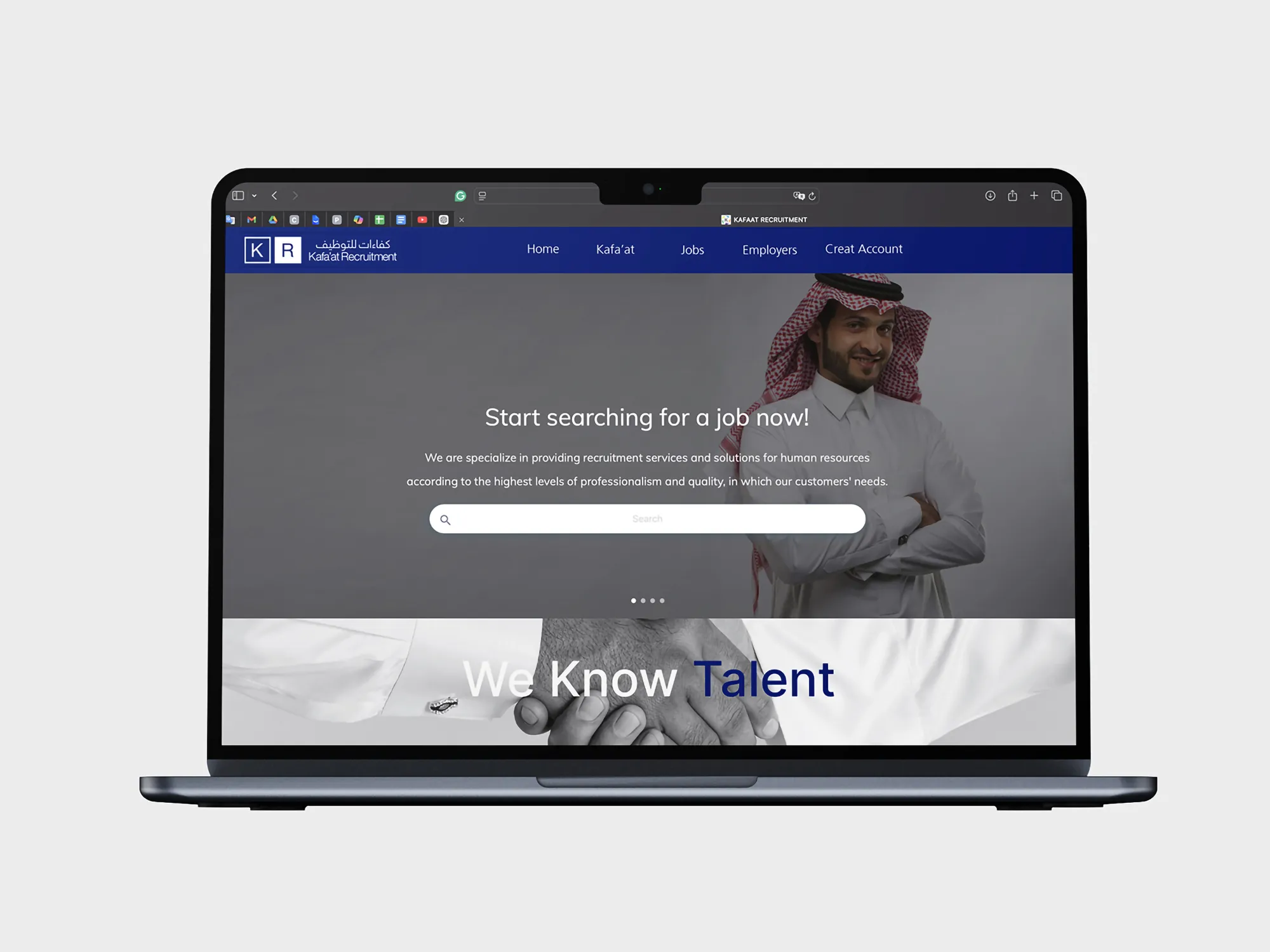
Color was reduced from five to one: a deep indigo blue. It carries authority, and used alone it makes the firm recognisable at a glance. On white it is the color of type, and on itself it is reversed to white, so the same blue works as ink and as background.
Typography is clean and restrained, with Arabic and Latin sharing proportions and spacing. Even the contact details on a business card are set in the brand blue, so the smallest line still belongs to the identity.
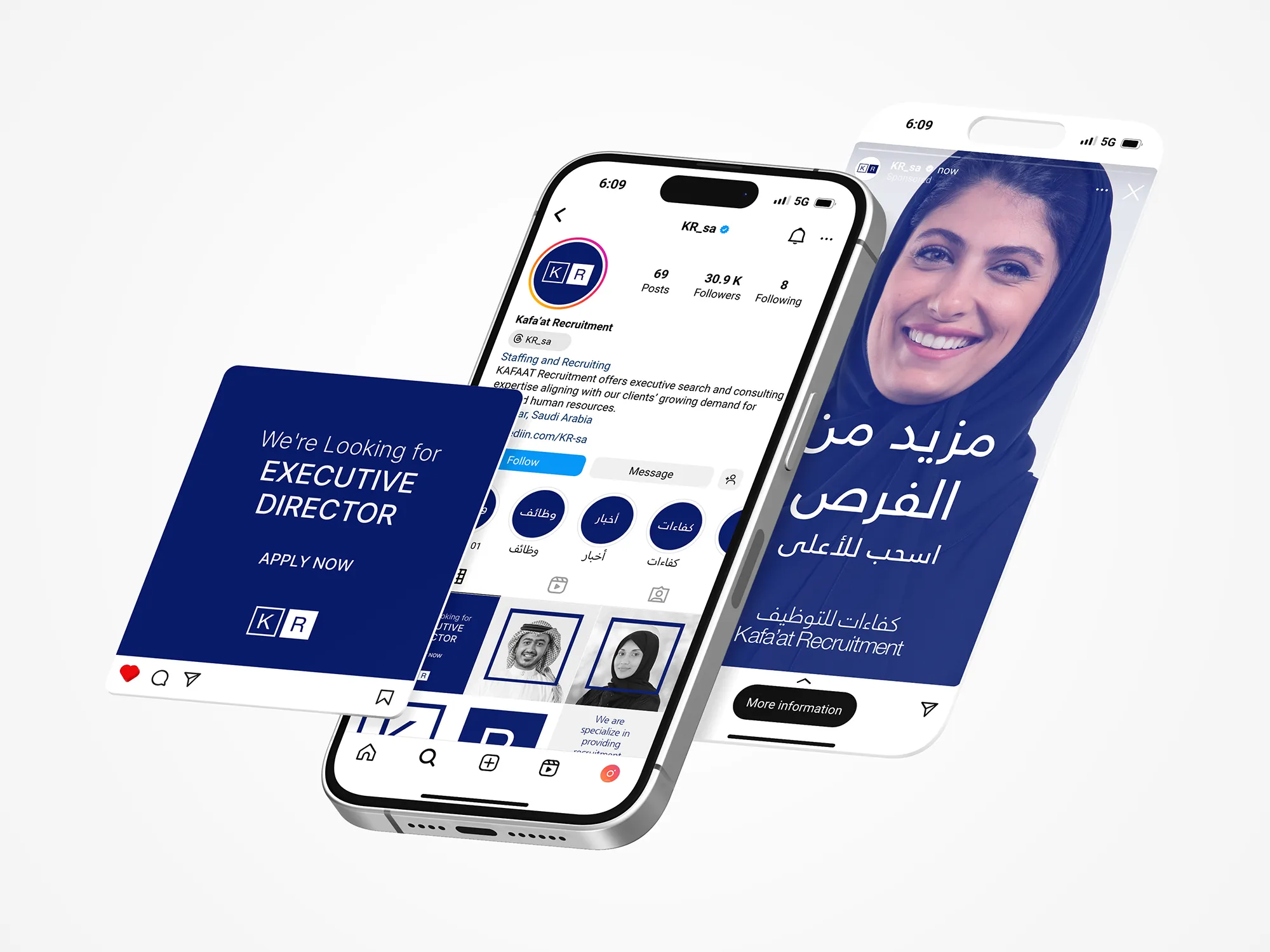
The frame is the monogram's square, enlarged into a device. A navy square wraps each portrait, so the people the firm is built around always appear inside the brand. On social profiles the idea appears as navy circles labelled in Arabic: jobs, news and competencies.
Photography is treated in monochrome. Portraits of people at work are shown in black and white, with the brand blue as the only color on the page. Blue text over grayscale images keeps every message legible and every layout unmistakable.
Stationery starts with the business card, made with two sides: a navy face carrying the reversed monogram and a white face carrying the names and details in blue, printed on thick, textured stock.
Digital applications extend the system to where the firm meets candidates every day: the social avatar and highlights, job posts in solid navy with white type and a direct call to action, story ads over a blue-toned portrait and a LinkedIn page framed by its banner. The brand guidelines set the rules for the logo versions, color, type and the frame, so the firm's team can make new posts and documents without redrawing the system.
The Voice
Kafa'at speaks with the confidence of a firm that knows its field. Its headline is three words, We Know Talent, a statement of competence that needs no support. Its Arabic campaign line, معًا نبني المستقبل (“together we build the future”), turns to partnership. Between them they describe what the firm offers, and Arabic and English carry the same tone and the same weight.
Results
The rebrand gives Kafa'at what the brief asked for: a refined, confident identity that communicates reliability, structure and long-term partnership.
The change is clear at a glance. Five colors became one, a swirl became a pair of squares, and a name in capitals became a composed bilingual lockup. The identity also travels well: the same blue, monogram and frame appear on a business card, a job post, a story and a LinkedIn banner, so a candidate or an employer recognises the firm before reading its name. The guidelines keep it that way as the team produces new material.
 Next projectAbdulla Murad→Leadership, Distilled.
Have a project in mind?
Let’s talk about it.
Say hello