
EVEZICH:
Strength, Structured
A Brand Identity Built on Skill, Precision and Quiet Confidence
EVEZICH is an established law firm in Washington State with more than 21 years of experience, handling personal injury, wrongful death and property subrogation cases. It is a small firm by choice, and it wins by preparation as much as by force.

Our services
- Brand Identity
- Logo Design
- Stationery
- Legal Document Design
- Signage
- Brand Guidelines
The Context
Legal branding speaks one visual language: scales, columns, gold leaf and heavy ornament. These signals promise tradition, and they make firms look interchangeable. At the moment a client is choosing a lawyer, that sameness offers little to go on.
People arrive at EVEZICH after life-changing injuries and property losses. Corporate and insurance clients arrive with complex claims and expect rigour. Both are making a serious decision under pressure, and both look for signs of competence before they speak to a lawyer.
The firm has never sought to become a large one. Its size keeps it responsive and nimble, and it has taken on major corporations and public bodies. Its brand had to show that a focused firm can stand next to much larger ones.

The Challenge
How does a small firm look as strong as the institutions it faces, without borrowing their clichés?
The identity had to be modern without losing gravitas, and confident without looking aggressive. It had to reassure an injured person and impress an insurer with the same few elements. And it had to hold in every place a law firm is judged: a business card, a letterhead, a case file, a filed document and the entrance to its office.


Strategy
We summarized the ambition in one sentence: strength, structured.
The firm's own motto gave us the idea. Tam Arte Quam Marte means “as much by skill as by strength.” It describes how EVEZICH works: careful preparation, focused expertise and patience, backed by the will to fight. We concluded that strength in this profession should be shown through structure. It should be visible in proportion, layering and precision, and it should not be shown by heavy emblems.
That decision set the rules. No symbols borrowed from the category, and no ornament that does not carry meaning. Where the category reaches for gold, we chose stone and cream. Every element had to look prepared, because a firm that wins through preparation should look prepared before it says a word.
Design
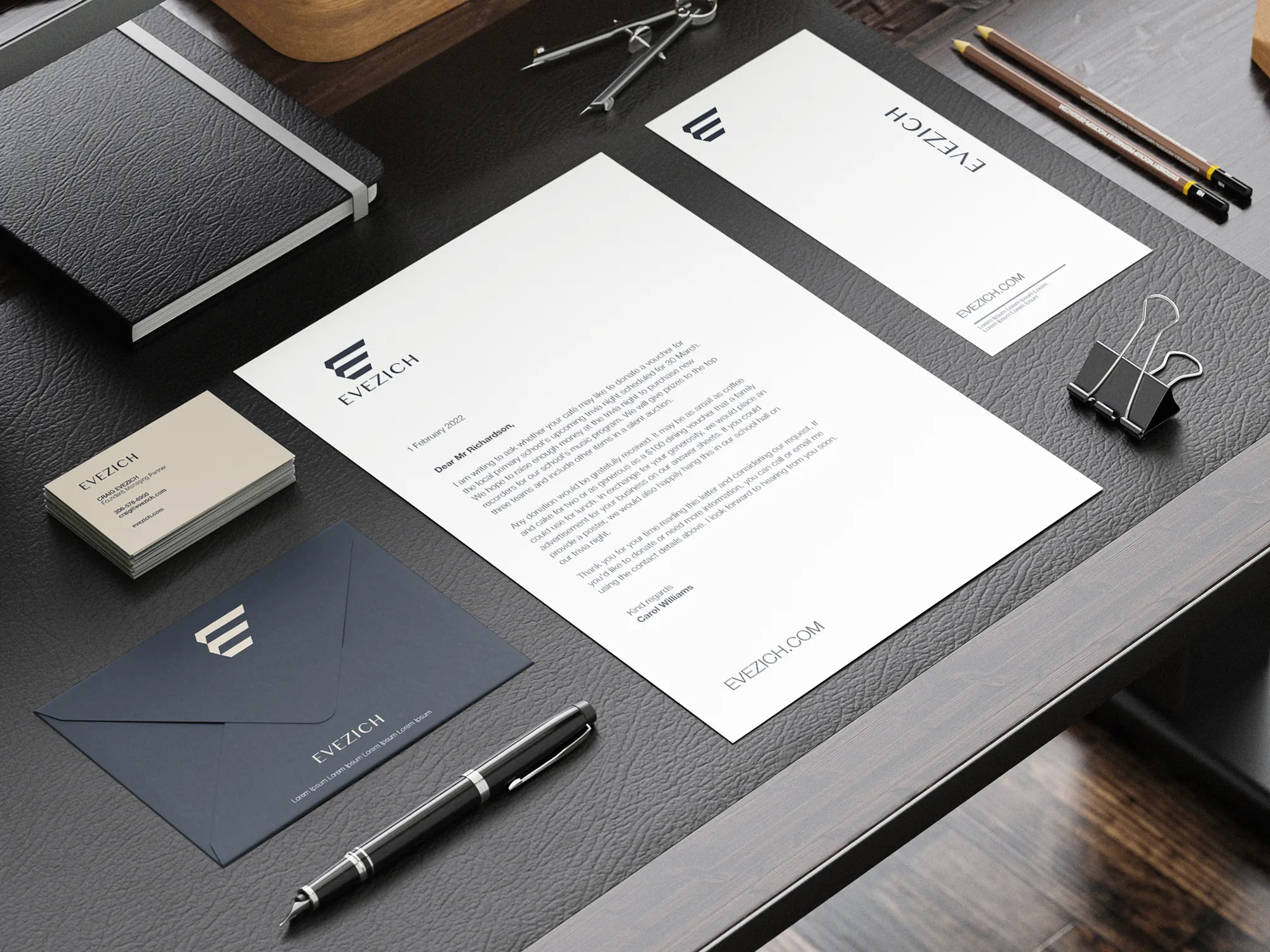
The mark is an E built from stacked horizontal bars, cut at an angle. It reads as a letter and as layers: pages, precedent, a case file built up piece by piece. The form is solid and architectural, and it holds its shape whether embossed on a navy cover, printed in the corner of a letterhead or set into a stone sign at a building entrance.
The wordmark sets EVEZICH in capitals, light in weight and widely spaced. It is unhurried and quietly confident, the opposite of the heavy, bold lettering the category often uses. Mark and name work together or apart, so the identity can be as compact as a corner detail or as open as a facade.
Color starts from a deep slate navy, warmed by a stone-like taupe and a soft cream, with white and black for documents. The navy carries seriousness, and the taupe and cream replace the gold of traditional legal branding with something calmer and more current. Navy and cream are also used as inversions of each other: a cream card with dark type, and a navy card with the mark embossed in taupe.
Typography pairs a refined serif for statements with a quiet, light sans for details. Hierarchy comes from scale and spacing, and nothing is ornamental. The website line at the foot of a letter is set in the same tracked capitals as the wordmark, so even a small detail feels part of the system.
Material and finish are part of the identity. The cards are printed on a thick, textured stock in cream and navy, the mark is pressed into the surface in a tonal foil, and the covers carry a linen-like grain. A firm that works with documents is judged by the feel of paper as much as by the look of the logo.
Stationery carries the system into daily use: the letterhead, compliment slip, envelope and business cards that clients, courts and opposing counsel see first. The letterhead places the mark at the top and lets the text run in a wide, calm margin.
Legal documents and files are branded with the same care. A navy binder marked Confidential, For Authorized Person Only turns a routine case file into a quiet statement of discretion. Navy folders carry a serrated taupe-and-white band, a graphic detail that adds movement to an otherwise ordered system.
Signage extends the identity to the physical entrance: a stone-textured pillar bearing the mark, the wordmark and the line Legal Excellence, Trusted Advocacy. The identity is delivered with brand guidelines, so the firm can apply it consistently across new materials.
The Voice
EVEZICH speaks plainly and with calm authority. Legal Excellence, Trusted Advocacy sets the pattern: two short ideas, each one a promise the firm can keep. Excellence is about the work, and trust is about the relationship.
Sentences are direct, the vocabulary is clear, and legal jargon is explained when it cannot be avoided. Clients under pressure need to understand, and the tone respects that. The confidence is quiet: it states what the firm does and lets the record make the claim, so the brand sounds the way it looks.
Results
The identity clearly expresses what EVEZICH stands for. Clients, insurers and opposing counsel understand at a glance that this is a credible, focused and confident firm, and it stands apart from traditional legal branding.
Consistency is visible from the smallest object to the largest. The same mark, the same palette and the same spacing appear at every touchpoint. The system gives the firm a coherent, professional presence, and a set of clear guidelines to keep it that way.
 Next projectOlive Tree→Rooted in Refinement.
Have a project in mind?
Let’s talk about it.
Say hello