
Wensah:
Good Company, Delivered
A Brand Identity Built on Warmth, Energy and Easy Familiarity
Wensah is an e-commerce app based in Oman, offering beauty, electronics, books, health items, perfumes and lifestyle essentials in one place. Its name is a word for friendly company, and the brand had to sound and look like it.
Our services
- Brand Identity
- Logo Design
- Visual System
- Packaging
- Stationery
- Promotional Materials
The Context
Wensah sells across categories that rarely share a shelf: lipstick, laptops, novels and vitamins. That range is the app's strength, and it is also a branding problem. A store that sells everything can end up with no face of its own.
The setting makes it harder. Customers meet Wensah on a phone screen first, then again at the door as a box, a bag or a tag. Inside the app, the shelves are filled with other brands' logos, colors and photography, changing by the day. Wensah's own brand has to stay recognisable through all of it, without competing with the products it presents.
It also has to speak two languages. The app is Omani and Arabic-speaking by nature and international by inventory, so the identity had to feel native in both scripts.
The Challenge
How does a store that sells everything have one personality?
The brief asked for an identity that is simple, unified and memorable, and that feels energetic, youthful and approachable. It also had to stay flexible: small enough for an app header, large enough to wrap a shipping box, readable over photography, and equally at home in Arabic and English.
Strategy
The idea was already in the name. ونسة is the Gulf Arabic word for friendly, easy company, the kind of conversation that makes time pass. We took that as the personality: a brand that behaves like a friend who knows what you are looking for. It is warm and quick, and it never lectures.
That became three rules. One name in two scripts, drawn with the same soft letters, so neither language is a translation. One warm color, a dusty rose that feels personal and gentle. And one gesture: the Arabic name drawn oversized, as a line, so that the name itself becomes the pattern.
Design
The wordmark is built in two scripts from the same soft geometry. The Latin wensah is lowercase, heavy and rounded, with open counters and smooth joins. The Arabic ونسة matches its weight and roundness, and the dot of the nun is a perfect circle, echoing the curves of the Latin a and e. Lowercase and rounded makes the name friendly before it says anything.
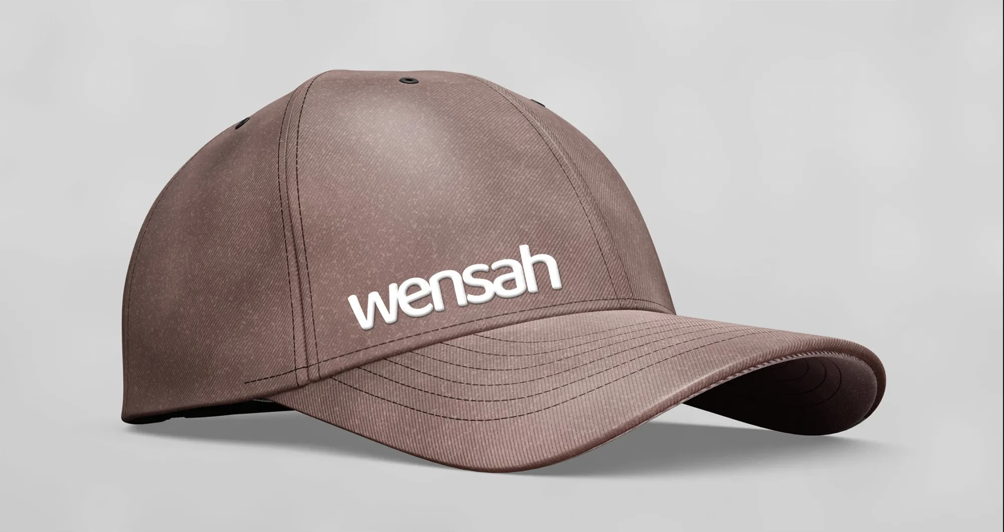
Two versions cover every scale. The solid version serves small and frequent uses: the app header, the cap, the tag and the bag. The outline version, drawn with a double line that reads almost as embossing, serves large surfaces.
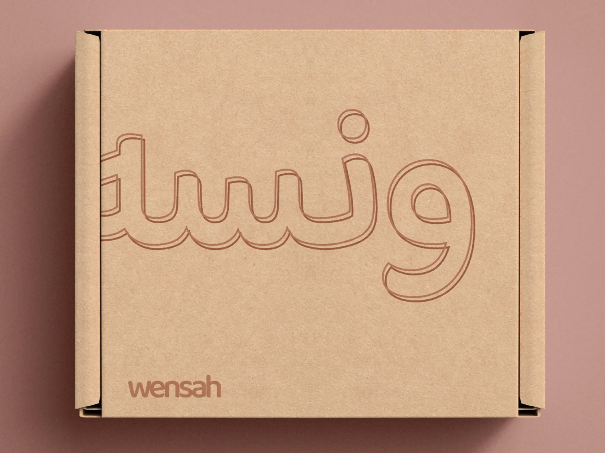
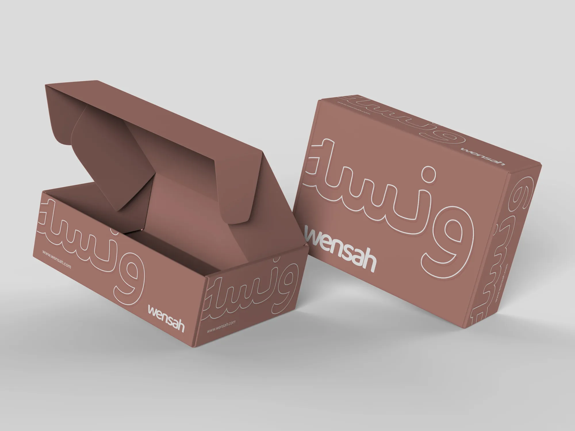
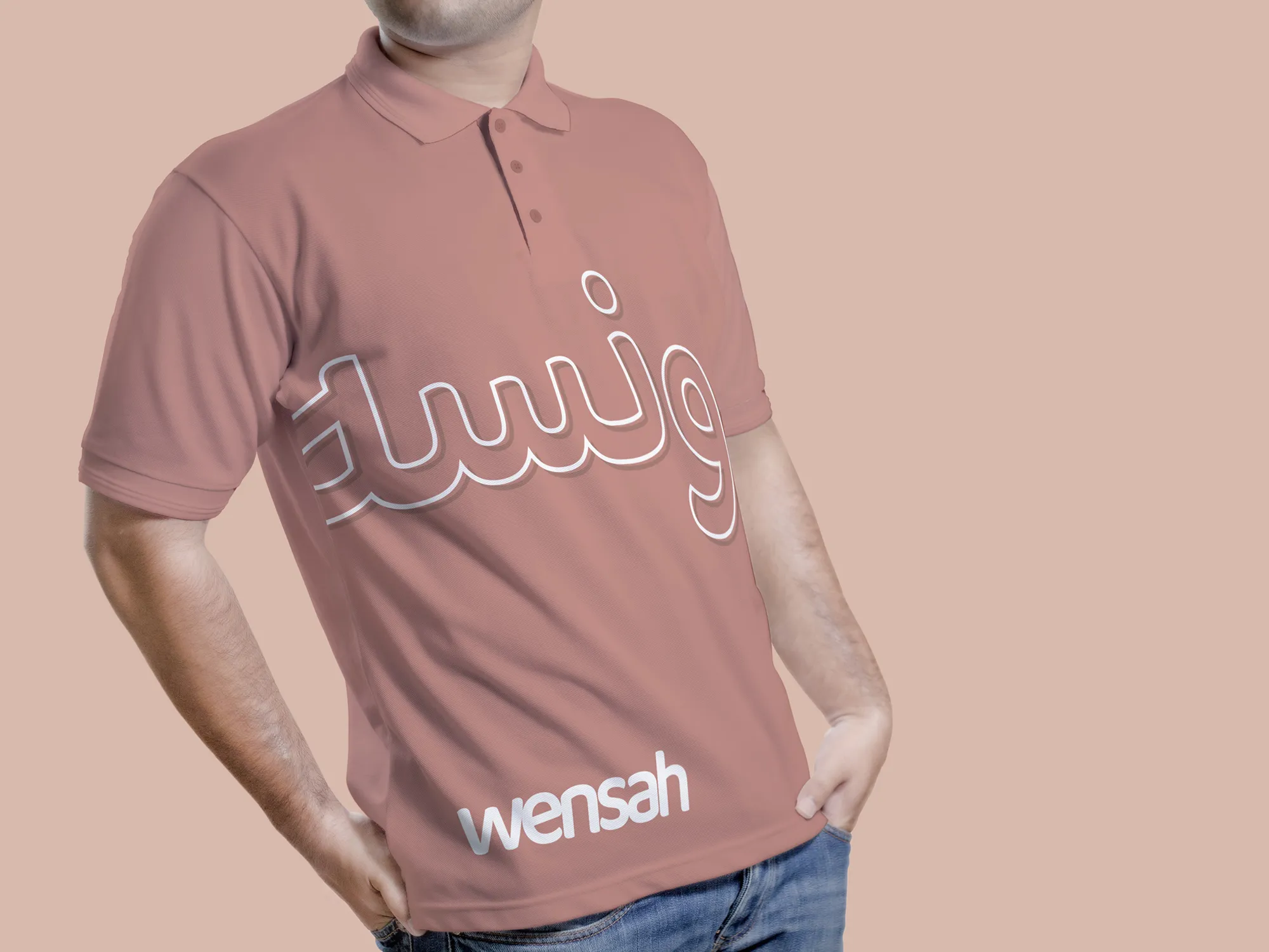
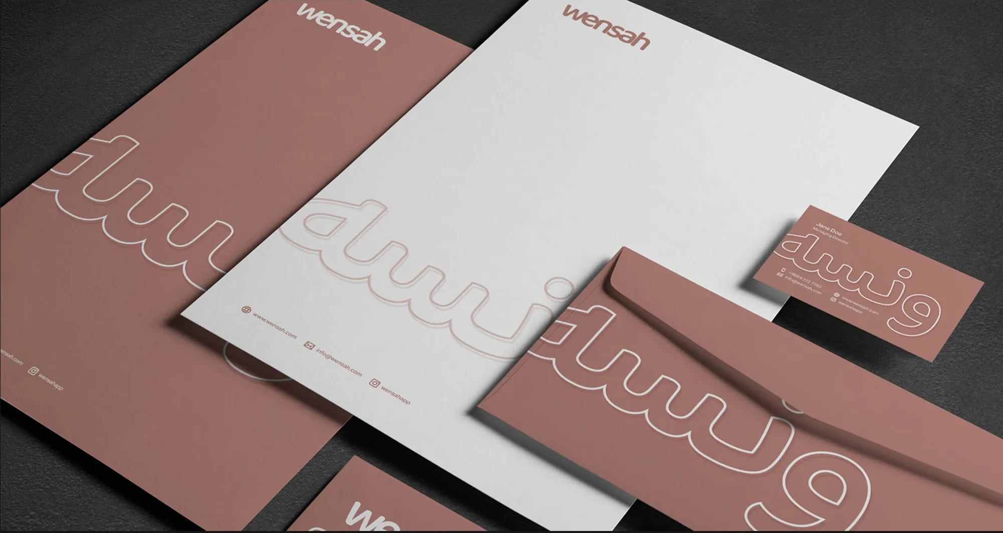
The outline pattern is the identity's signature. The Arabic name is enlarged past the edges of the object and cropped, so it wraps around folders, envelopes, boxes, a shopping bag and a shirt. Cropped, it stops being a logo and becomes a texture, and a small solid Latin wordmark completes the reading. The effect is recognisable from a distance without needing to be read.
Color is built from a dusty rose, white and the natural brown of kraft board, with charcoal for darker campaign layouts. The rose fills stationery, tags, the bag, the cap and the polo, and softens into blush on the app's banners. Because it is a warm, muted tone, it can sit beside the loud colors of other brands' products without being drowned.
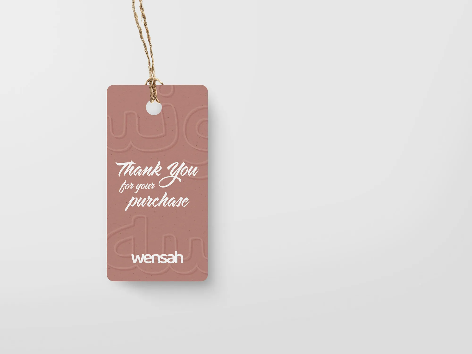
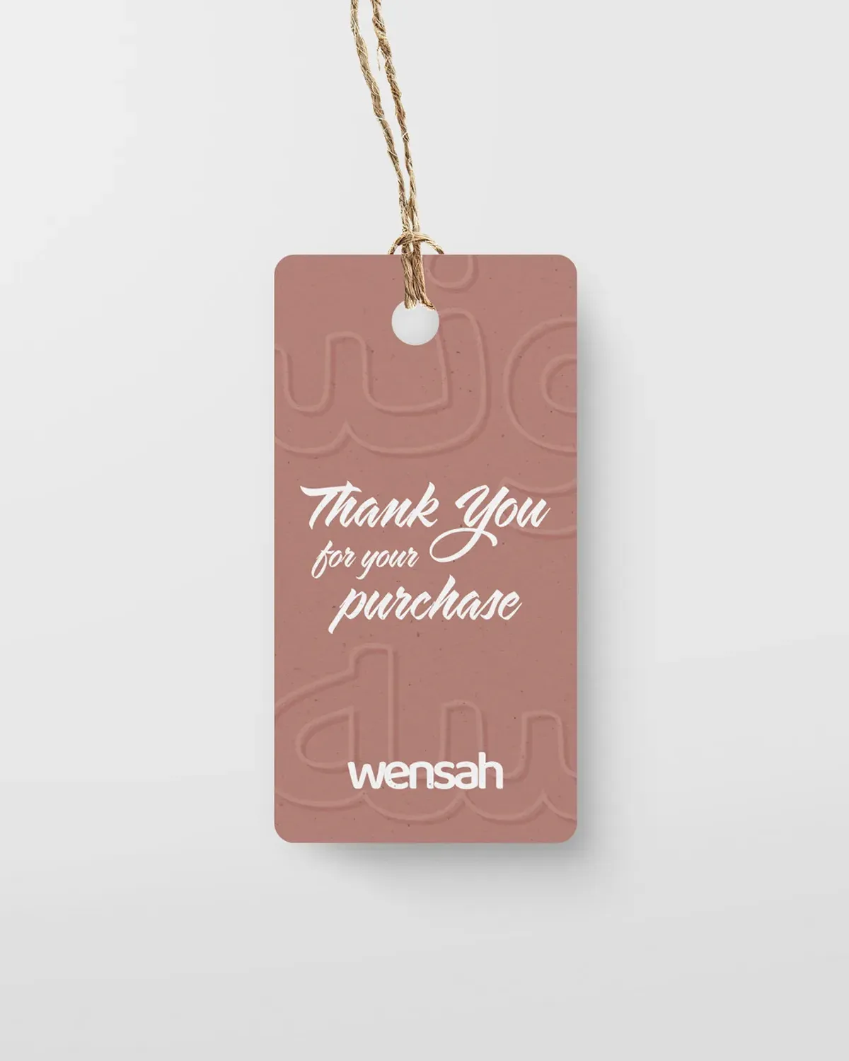
Typography stays out of the way of the wordmark's character. The one moment of personality comes on the hang tag, where Thank you for your purchase is set in a hand-lettered brush script, so that a thank-you looks like a note.
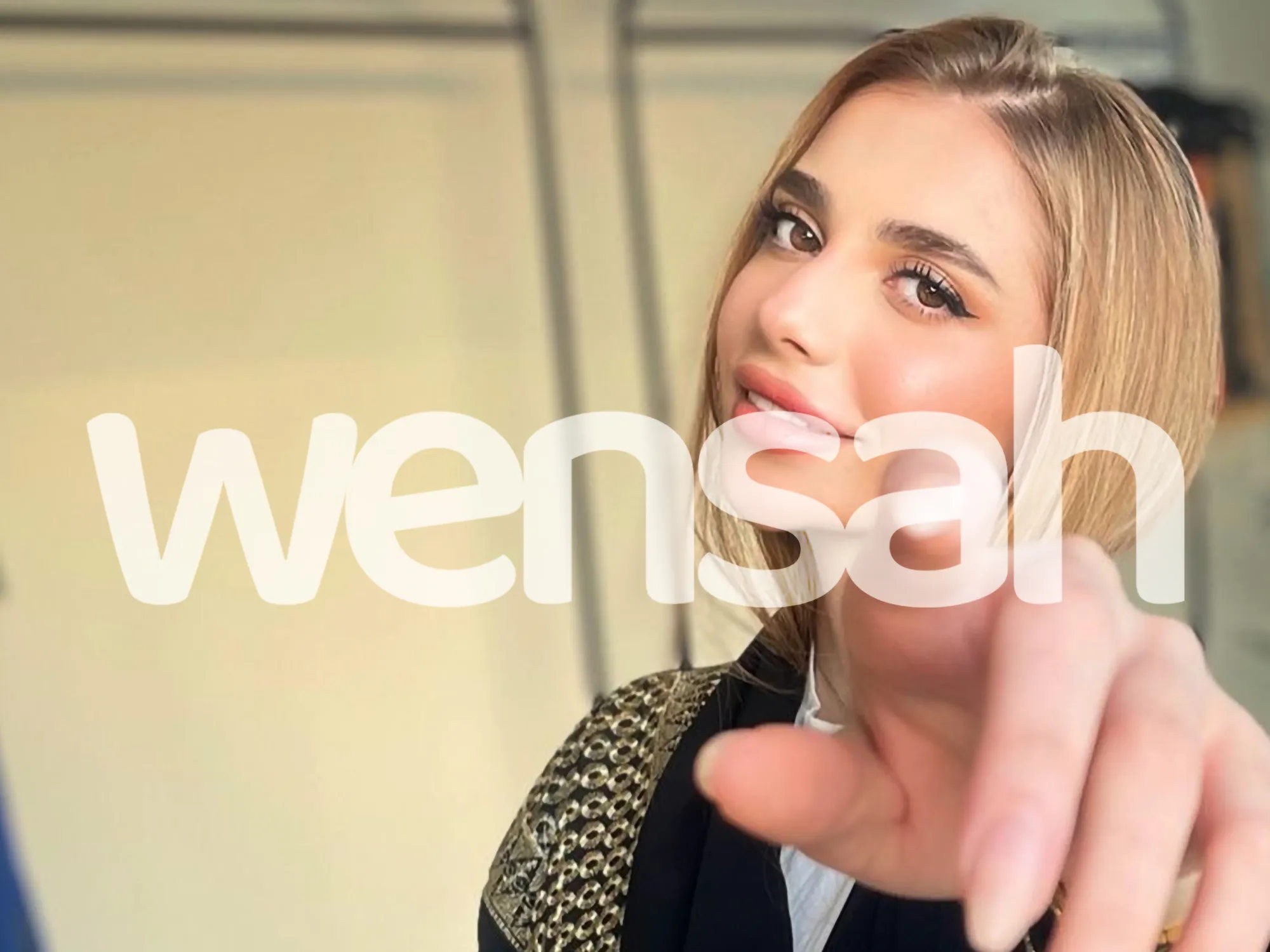
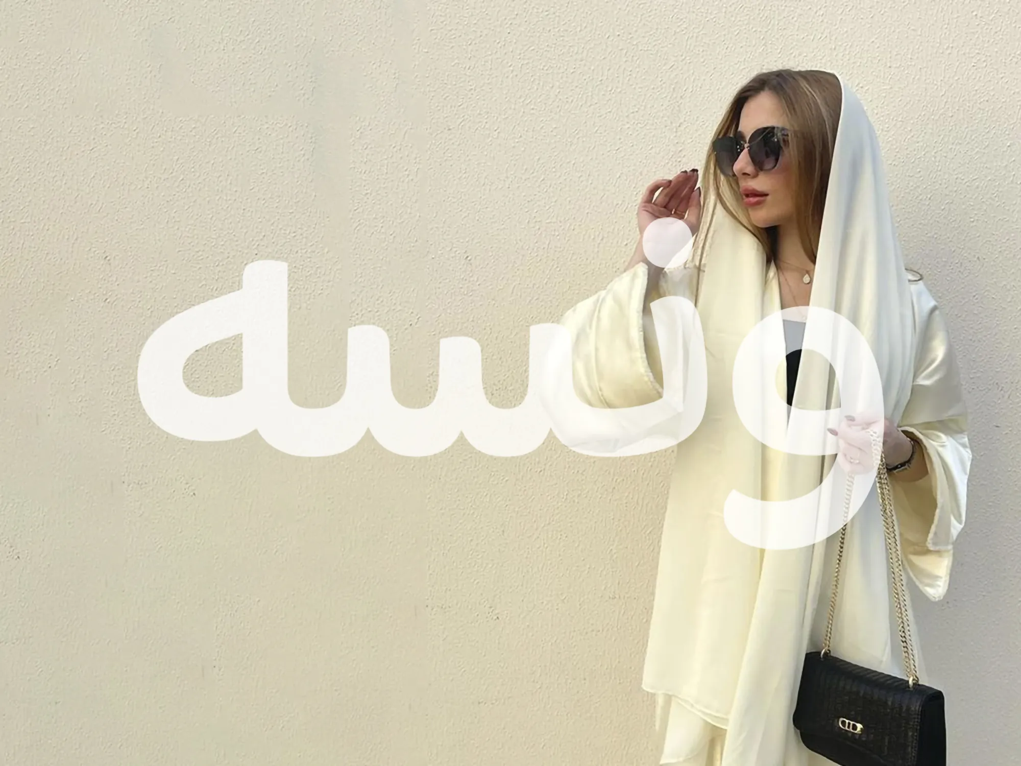
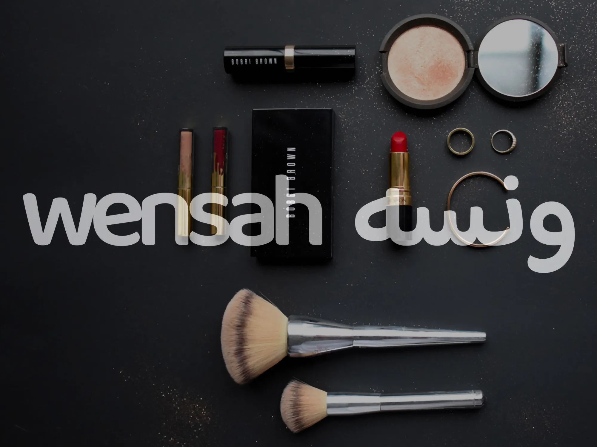
Photography is part of the system. Portraits of people looking at the camera carry the wordmark at large scale in translucent white, like a greeting laid over the picture. One portrait points straight at the viewer, and the pose says what the brand says: this is for you. Product flat-lays on dark backgrounds carry the same overlay.
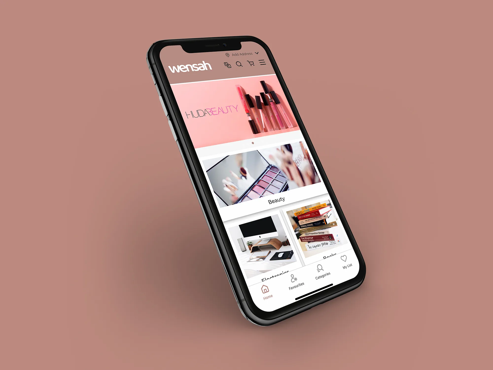
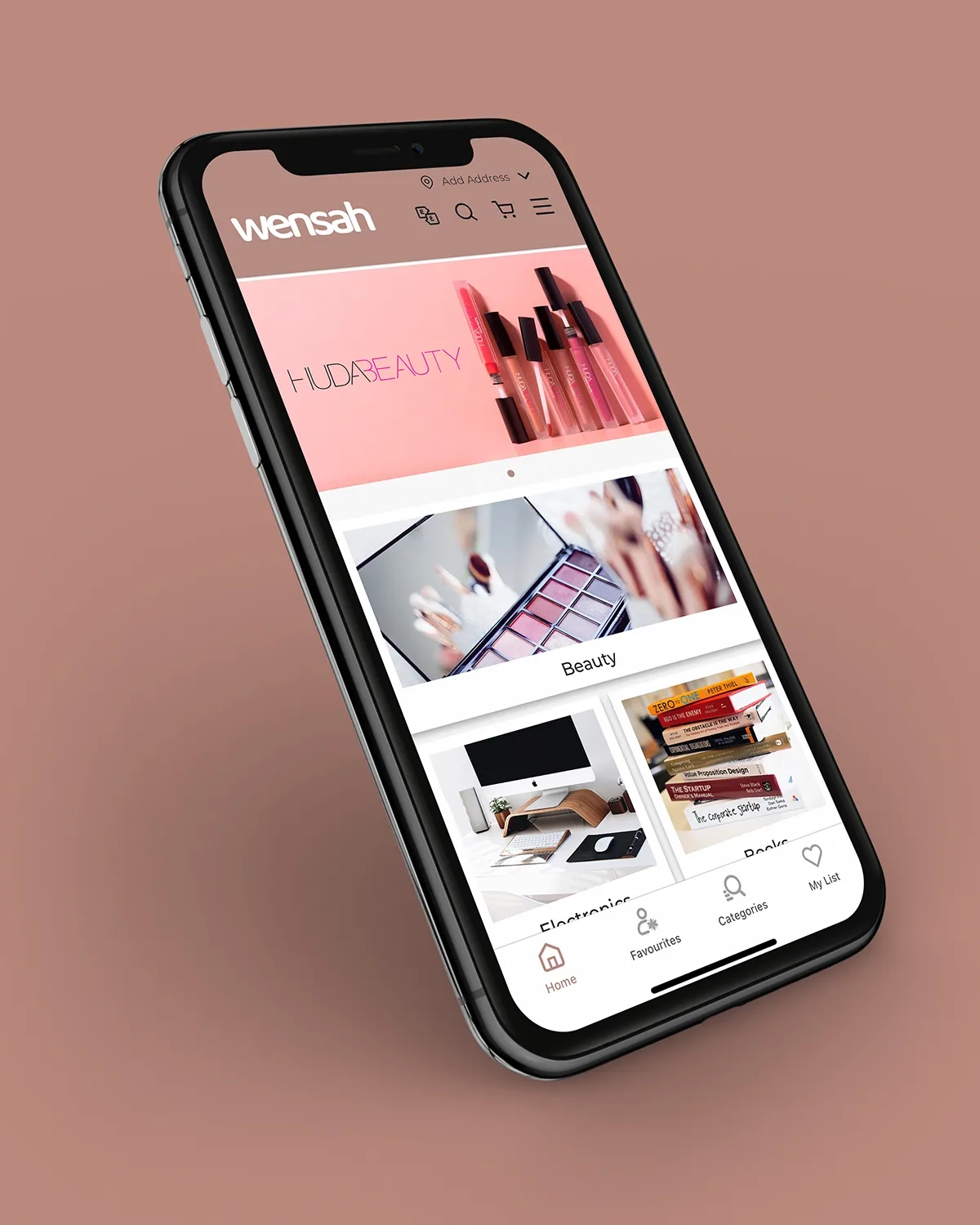
The app is where the identity meets the customer first. A white header carries the rose wordmark, the bottom navigation uses the rose for its active state, and promotional banners in blush frame the products. The brand stays quiet enough for products and partner brands to lead, and present enough to be recognised.
Packaging brings the outline pattern into the customer's hands. Rose-brown mailer boxes are wrapped in the wordmark. A kraft box carries the same pattern in a single terracotta ink, an economical print that suits the material. The shopping bag and the embossed hang tag repeat it.
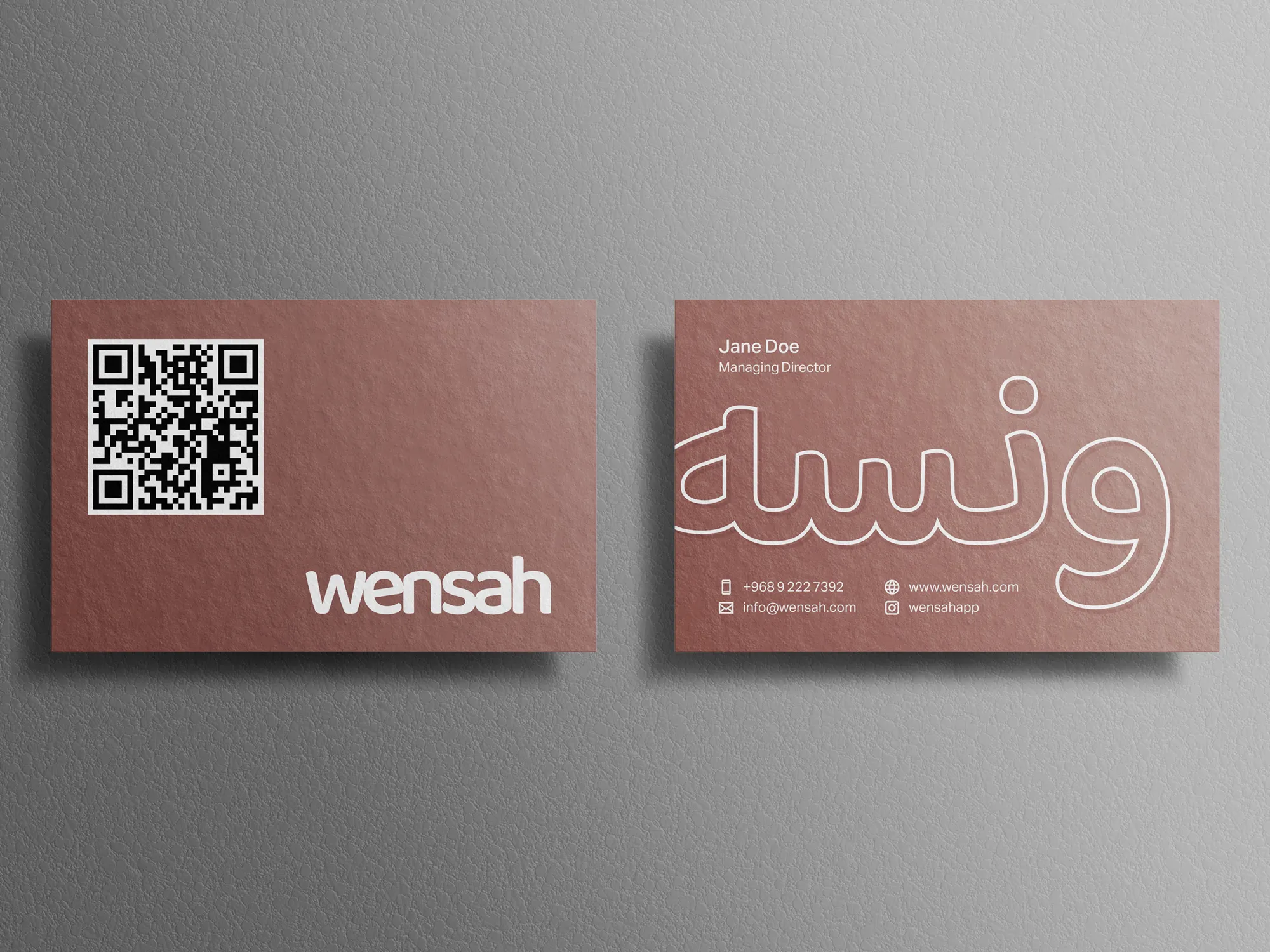
Stationery carries the system into business use: a letterhead, an envelope and folders in rose, and a business card printed on textured stock. One side of the card holds a QR code and the solid wordmark, and the other holds the oversized outline pattern with the contact details beneath. Apparel completes the picture with a cap and a polo shirt, each with the wordmark large.

The Voice
Wensah speaks the way a friend does: in short, plain, personal words. Its labels are simple: Beauty, Electronics, Books. Some are possessive: My List, Favourites. And it thanks the customer in handwriting.
There is no promotional shouting and no formal store language. The tone is warm and light, and it treats shopping as company and not as a transaction.
Results
Wensah has an identity that is easy to like and hard to mistake: simple, unified and friendly. The wordmark works at the size of a header icon and at the size of a box, and the same rose, the same rounded letters and the same outline appear on the app, and other applications. A customer who meets one piece recognises the others.
That consistency supports recognition and engagement: a brand people can spot across very different products, and one that feels as if it is speaking to them.
 Next projectGreenscapes→Growth, by Design.
Have a project in mind?
Let’s talk about it.
Say hello