

Sarah Sultan:
Tailored to Last
A Brand Identity Built on Elegance, Balance and Timeless Appeal
Sarah Sultan is a fashion house in Kuwait. Its garments are made to be worn with quiet confidence: pieces that do not ask for attention and still hold it. The brand had to carry that same confidence, from the first glimpse of the name to the moment a box is opened.
Our services
- Brand Identity
- Logo Refinement
- Visual Language
- Packaging
- Stationery
- Tone of Voice
The Context
Kuwait's luxury fashion market is confident, image-conscious and crowded. Its clients follow collections closely, and they know the difference between a house that shouts and a house that is sure of itself.
Many competing houses reach for the same signals: gold, flourish and the trend of the season. These signals are quickly copied, and they fade with the collection that carried them. In a market like this, recognition is the real currency, and it is earned through consistency across years rather than volume in a single season.
For a house that already had a name, the question was not how to be noticed. It was how to be remembered.
The Challenge
How does a fashion house stay recognisable without repeating itself, and feel exclusive without feeling distant?
Collections change every season, and each one needs room to feel new. The identity had to be the constant behind them: strong enough to be remembered on a label, a bag or a business card, and quiet enough to let each collection lead. It also had to hold at every scale, from a small garment tag to a large shopping bag, and remain premium in each.
Strategy
We summarized the brand's ambition in one sentence: tailored to last.
Tailoring is the discipline of fit. Every line is cut on purpose, every seam has a reason, and nothing is left loose. We applied the same discipline to the brand. Rather than reinventing a name that clients already recognised, we chose refinement: keep what the market already knows, and perfect how it is drawn, spaced and finished.
Every decision was tested against one question: does this add elegance, or only decoration? What failed the test was removed. The result is a brand that does not follow the season. It should feel as right in ten years as it does today.

Design
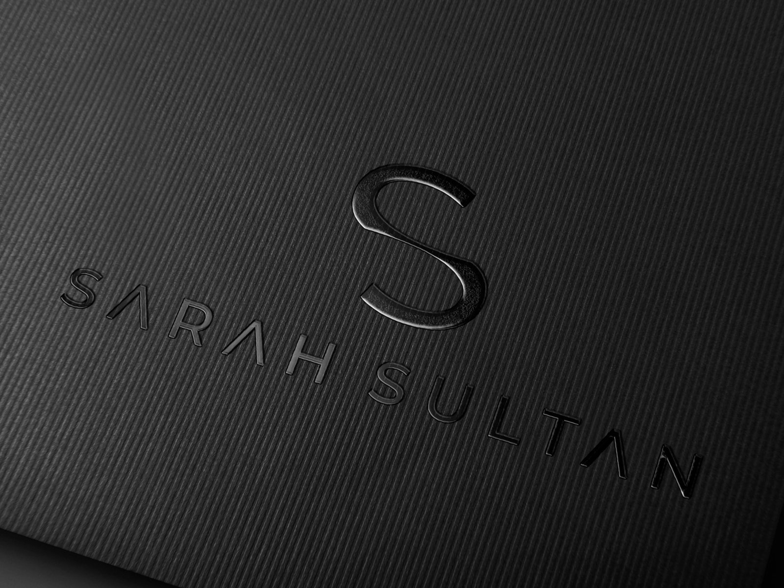
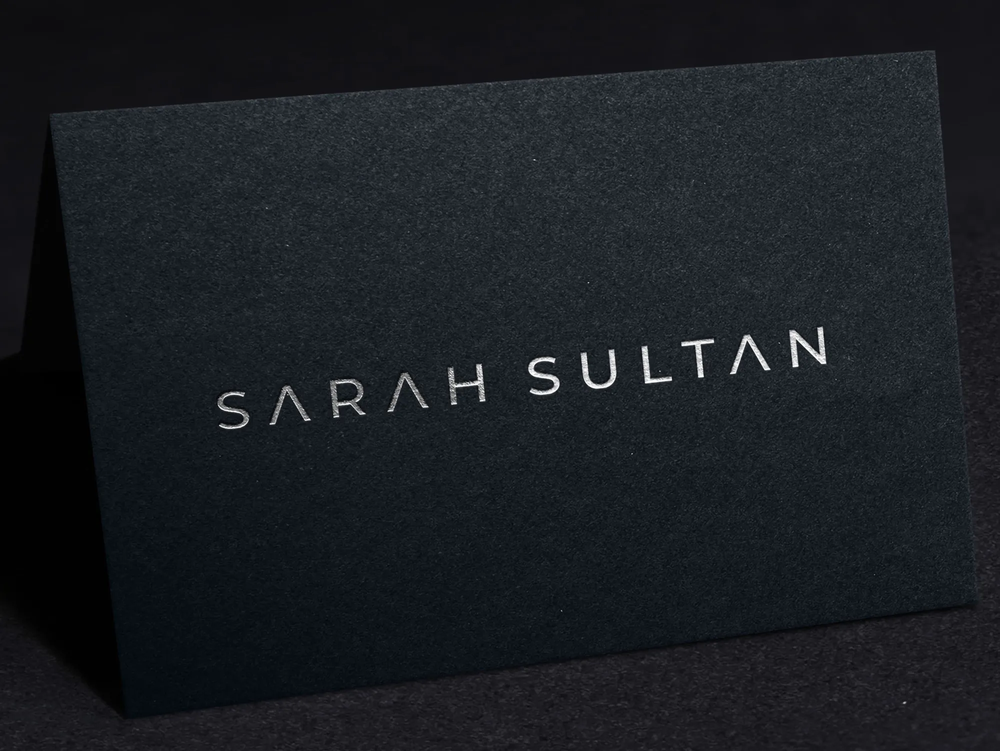
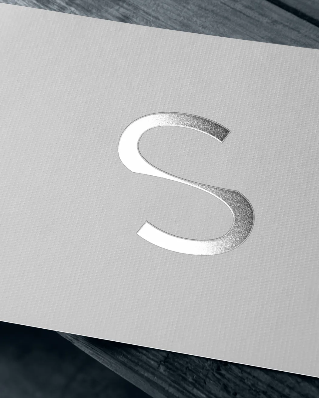
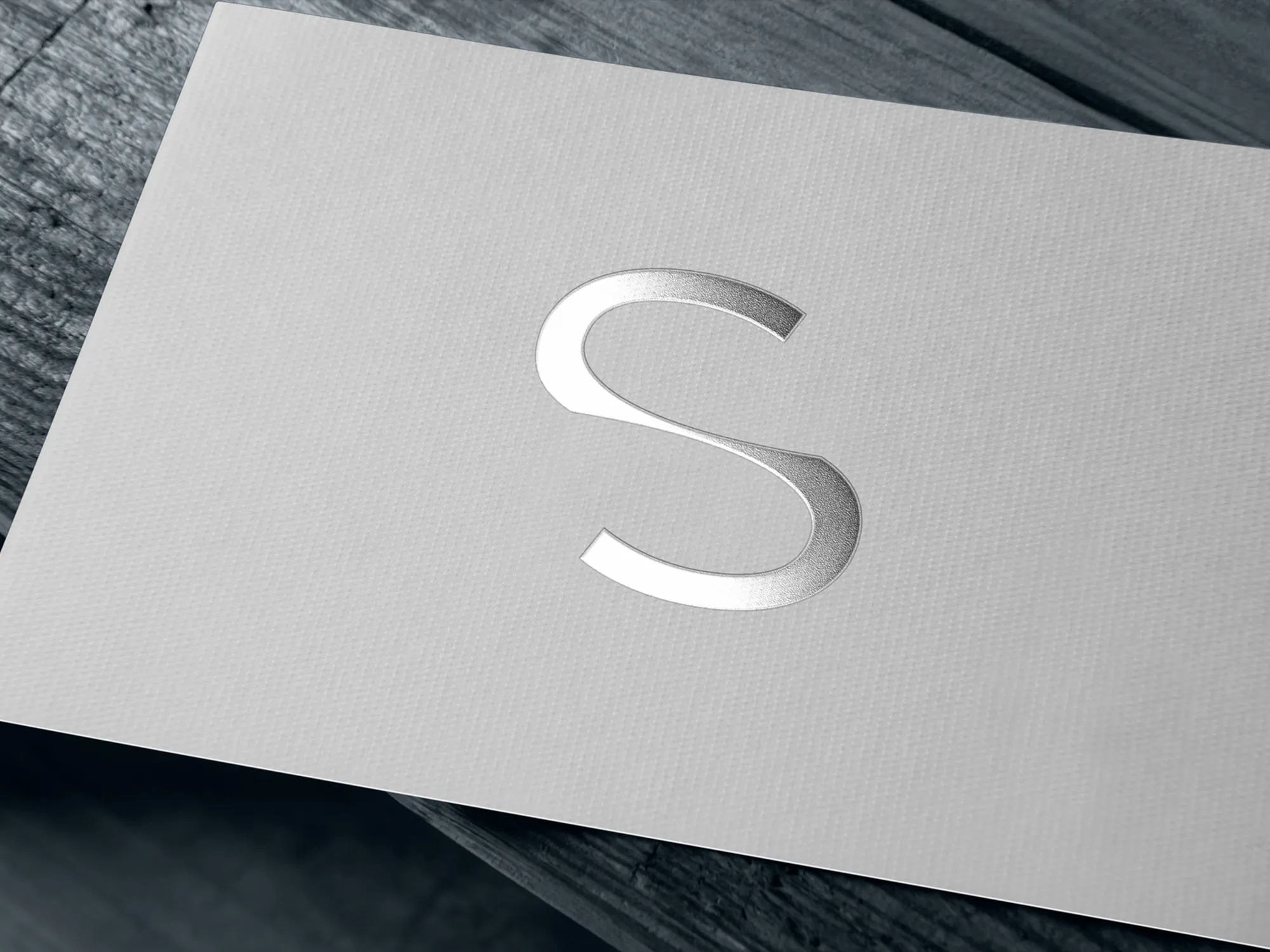
The logo was refined, not replaced. The name already carried recognition, so we worked on what a tailor works on: proportion, spacing and finish. Each letter was adjusted until the mark held its shape at every size, and the space around it was set so it never feels crowded or thin.
The visual language is built on balance. Generous space surrounds every element, text and image keep a steady rhythm, and a small set of alignment rules holds the system together. Nothing competes for attention, so the name and the product can speak.
Typography is quiet and precise. Weight and spacing carry the hierarchy, and the type never performs. The result reads as edited, like a wardrobe with no wasted pieces.
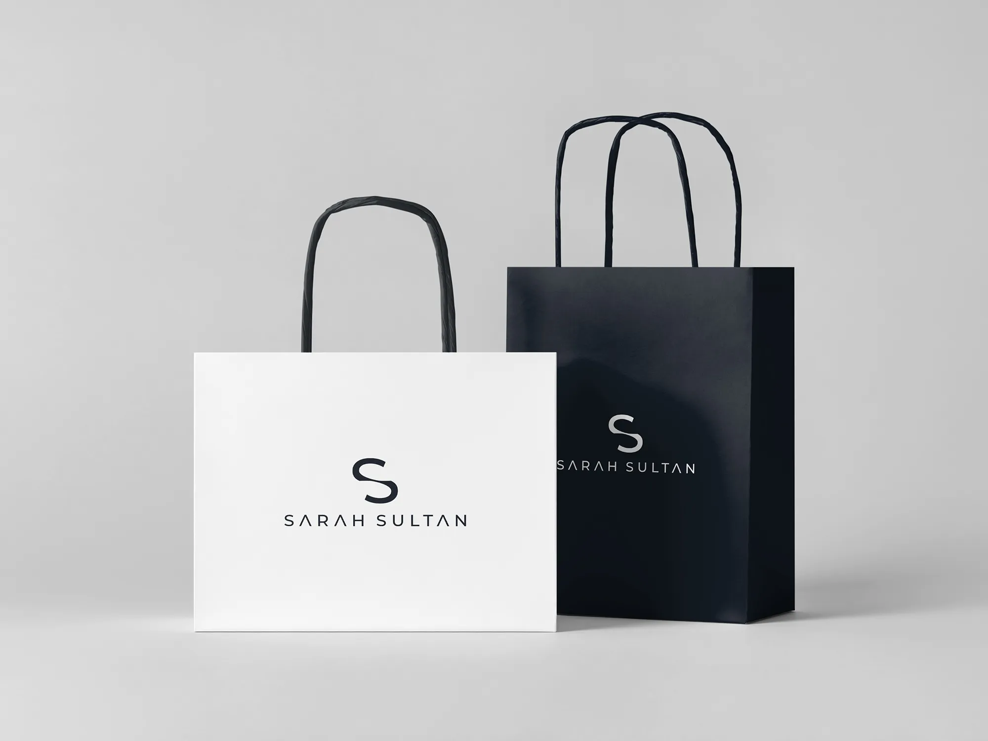
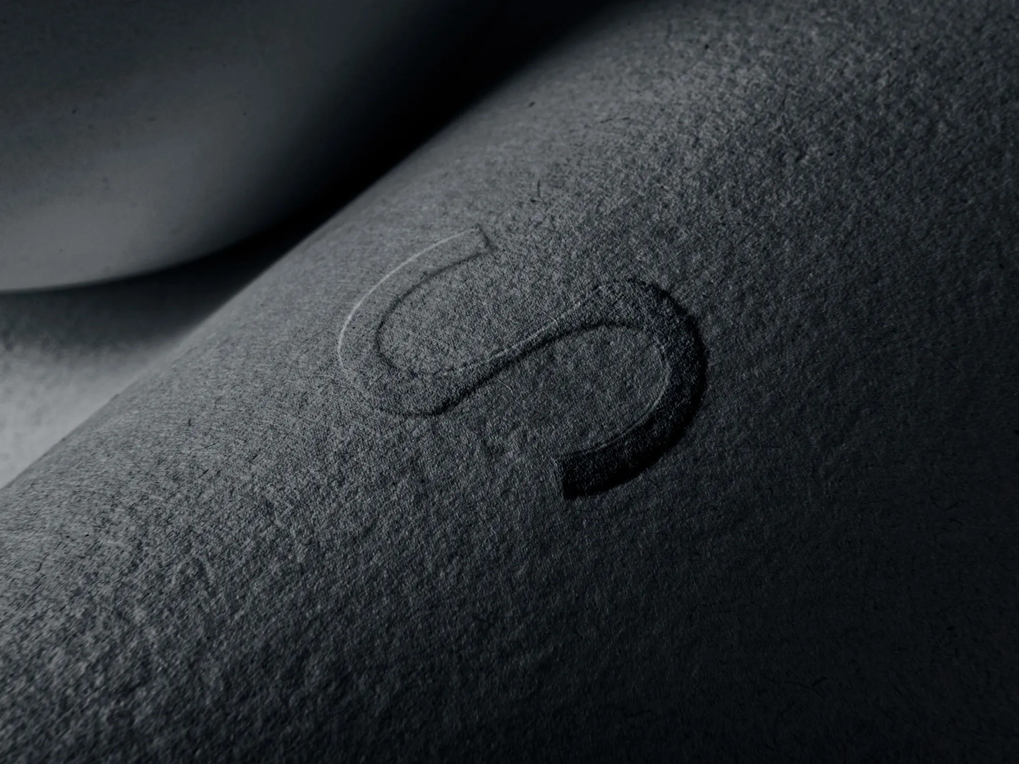
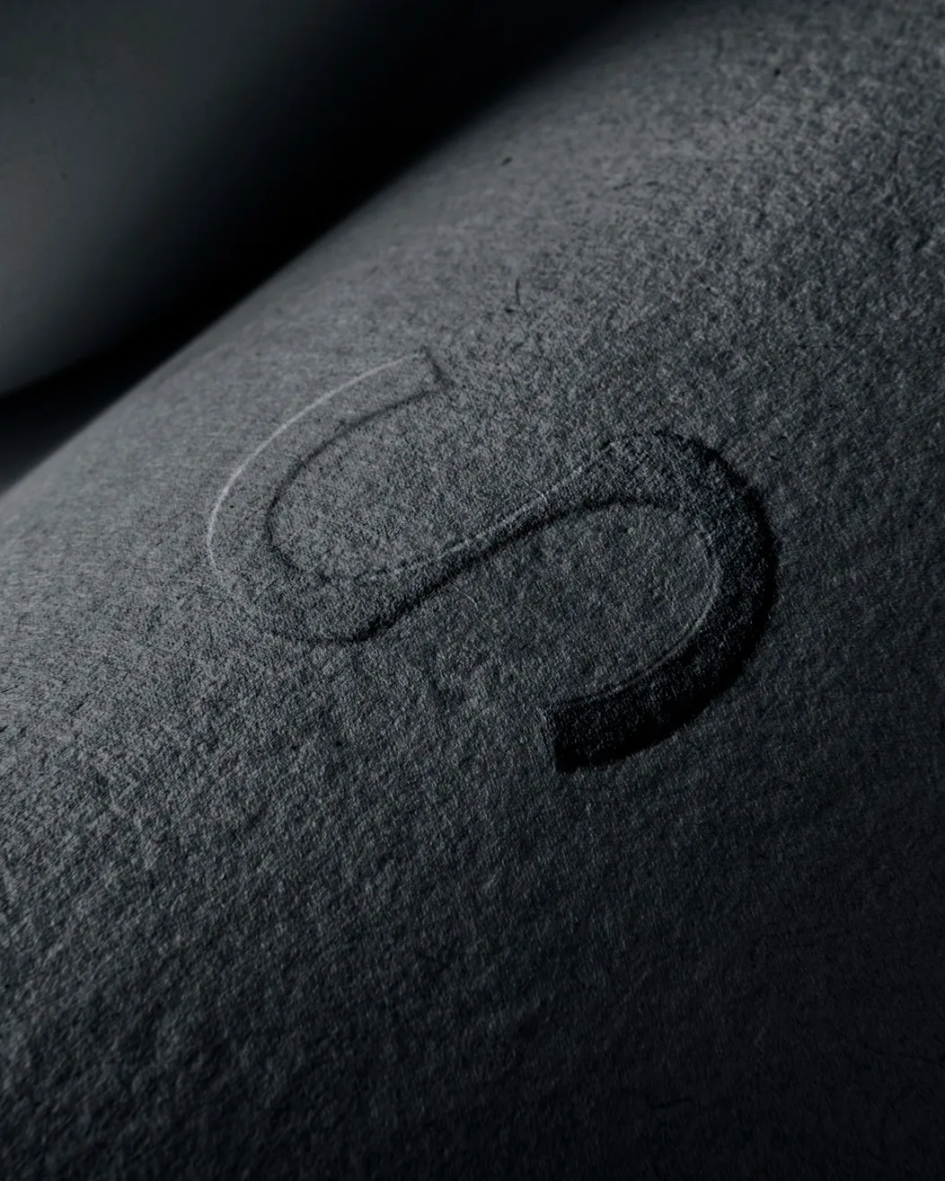
Color and material follow the same restraint: a measured, tonal palette and finishes chosen for how they feel in the hand. A premium brand is judged by touch as much as by sight, so paper, print and finish were treated as part of the identity.
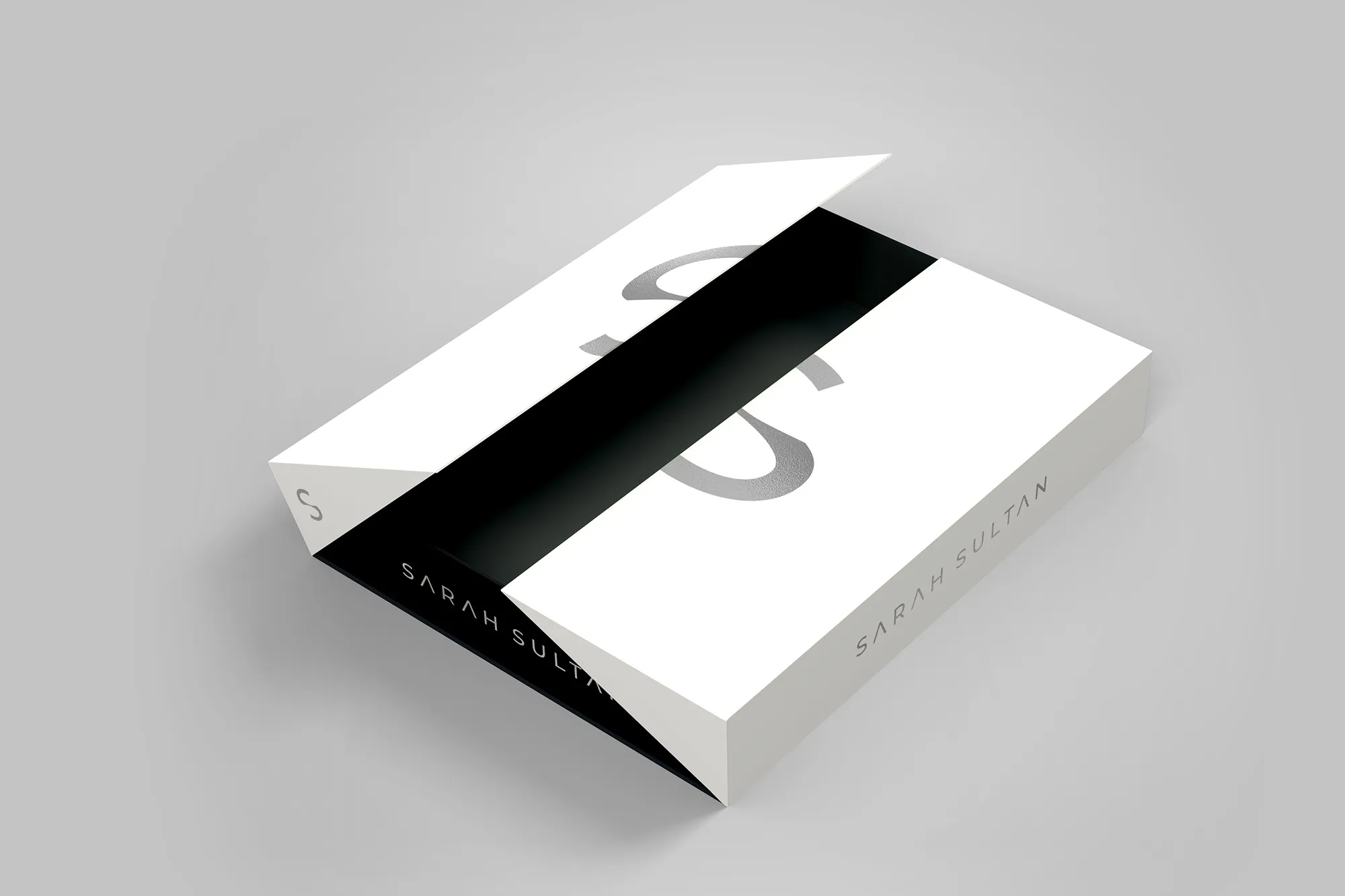
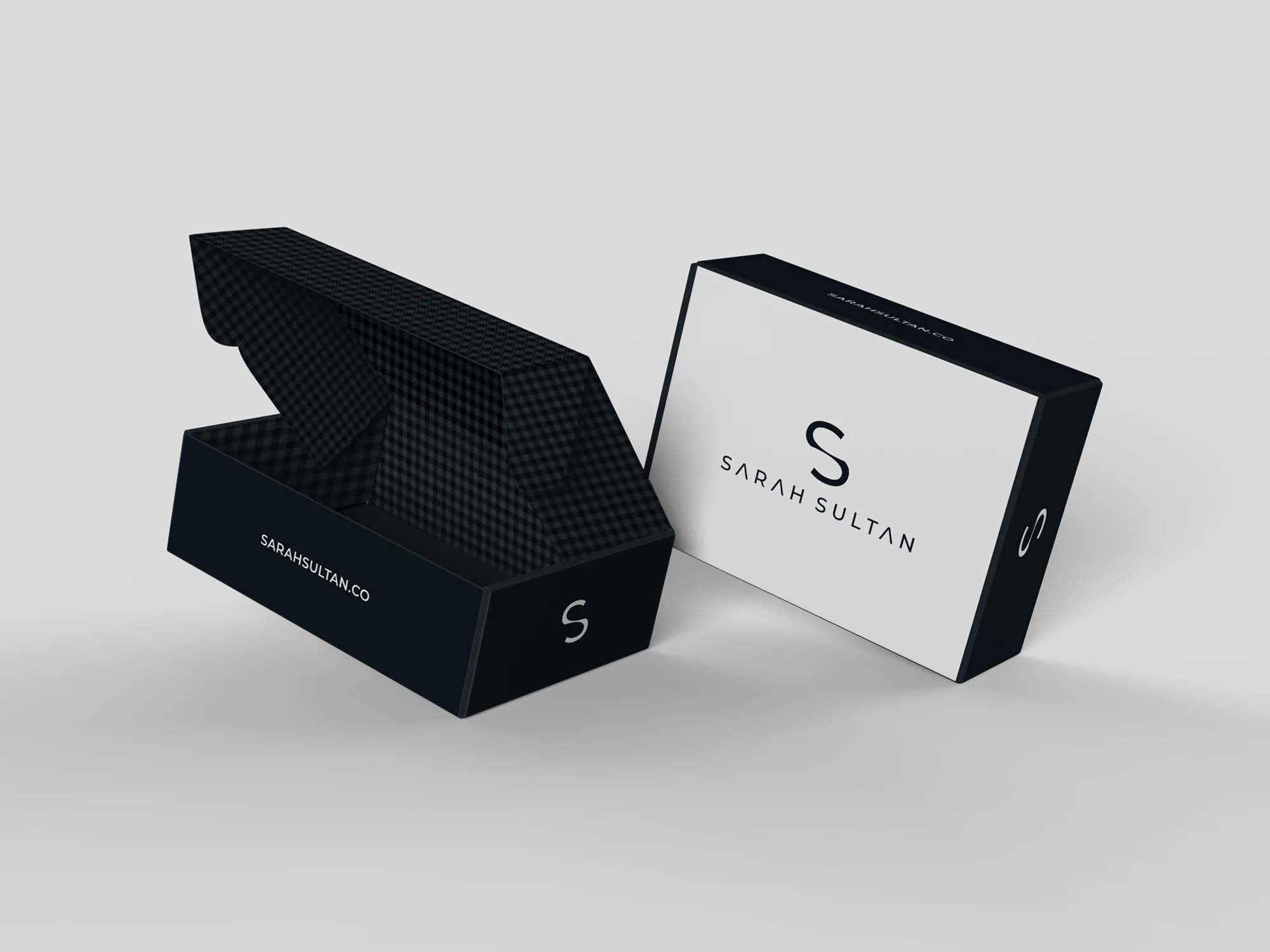
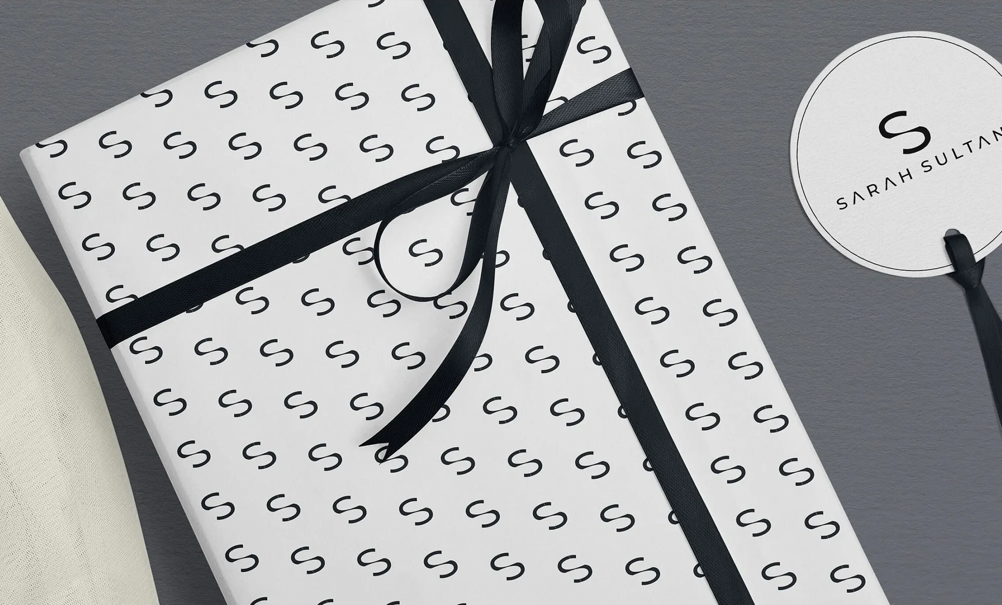
Packaging is the first moment a client physically meets the brand, so it is designed as part of the garment's story. Opening the box should feel like the first fitting: unhurried, deliberate and a little ceremonial.
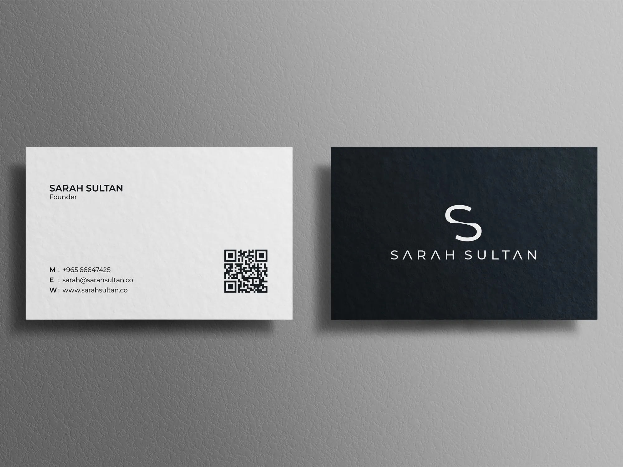
Stationery carries the same care into the cards, letterheads and notes that a client keeps. They are small objects, but they repeat the brand's promise long after the purchase.
The Voice
Sarah Sultan speaks the way a good tailor does: calmly, warmly and precisely. Few words, all of them chosen.
There is no exaggeration and no fashion cliché, and nothing that the garment has to apologise for. The tone treats the client as someone with taste, who does not need to be persuaded. It runs through packaging notes, cards and every message a client receives, so the brand sounds the way it looks.
Results
The identity clearly expresses what Sarah Sultan stands for. Clients recognise the house at a glance, and they understand, before touching a fabric, that this is a brand with taste, patience and a long horizon.
Consistency is visible from the logo to the packaging and stationery, and it strengthens recognition with every encounter. A set of simple rules for proportion, space and finish keeps each new collection, box and card in the same hand, and gives the house a premium presence built to last.
 Next projectEVEZICH→Strength, Structured.
Have a project in mind?
Let’s talk about it.
Say hello