
LYN ADVISORY:
Identity as Infrastructure
A Brand Identity Built on Restraint, Precision and Longevity
LYN Advisory is an American advisory firm based in Prosper, Texas, that helps leadership teams turn complex priorities into clear decisions and practical execution. Its work is judgment, and its clients are hiring someone else's clarity.

Our services
- Brand Strategy
- Brand Identity
- Logo and Symbol
- Visual System
- Brand Guidelines
- Stationery
- Digital and Social Applications
- Signage
The Context
Advisory is bought on trust. A leadership team that brings in an outside adviser is handing over its hardest questions, and it decides whether to do so long before the first meeting, on the strength of what it can see: a proposal, a deck, a LinkedIn page, an email signature.
That is where an advisory brand actually lives. Not on billboards, but in headers, footers, PDFs, invoices and templates, applied by many hands over many years. The category tends to answer with one of two looks: the borrowed authority of skylines and handshakes, or the fashionable polish of a young boutique. Both date quickly.
The firm's own positioning pointed elsewhere: serious, dependable and built to last.
The Challenge
How do you build a brand that feels like infrastructure and is still recognisable?
The brief was one of restraint. The identity had to read cleanly at small sizes and in dense documents, hold up in black and white as a first-class state, and stay correct when different people applied it. But a wordmark alone can be invisible in a social avatar or a favicon, and the firm still had to be found, followed and remembered. The task was to earn recognition without spectacle.


Strategy
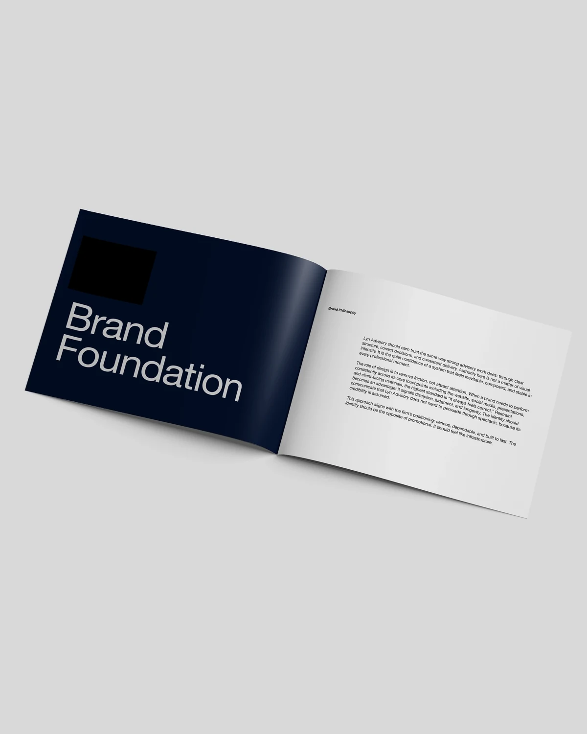
The strategy began as a document. Before any drawing, a Brand Foundation and Identity Strategy set out the philosophy and the rules: trust earned the way strong advisory work earns it, through clear structure, correct decisions and consistent delivery. The role of design was to remove friction, not to attract attention. The standard was a single sentence: it always feels correct.
Five principles governed every decision: restraint by default, clarity over decoration, consistency across contexts, longevity over trends and purposeful minimalism. If an element did not strengthen them, it did not belong.
That included the symbol. The foundation made the wordmark the primary solution and set a strict test for anything more: a symbol would be pursued only if it improved recognition in constrained contexts, provided functional utility, or increased cohesion. Otherwise the correct decision was no symbol. The design that followed was built to pass that test.

Design
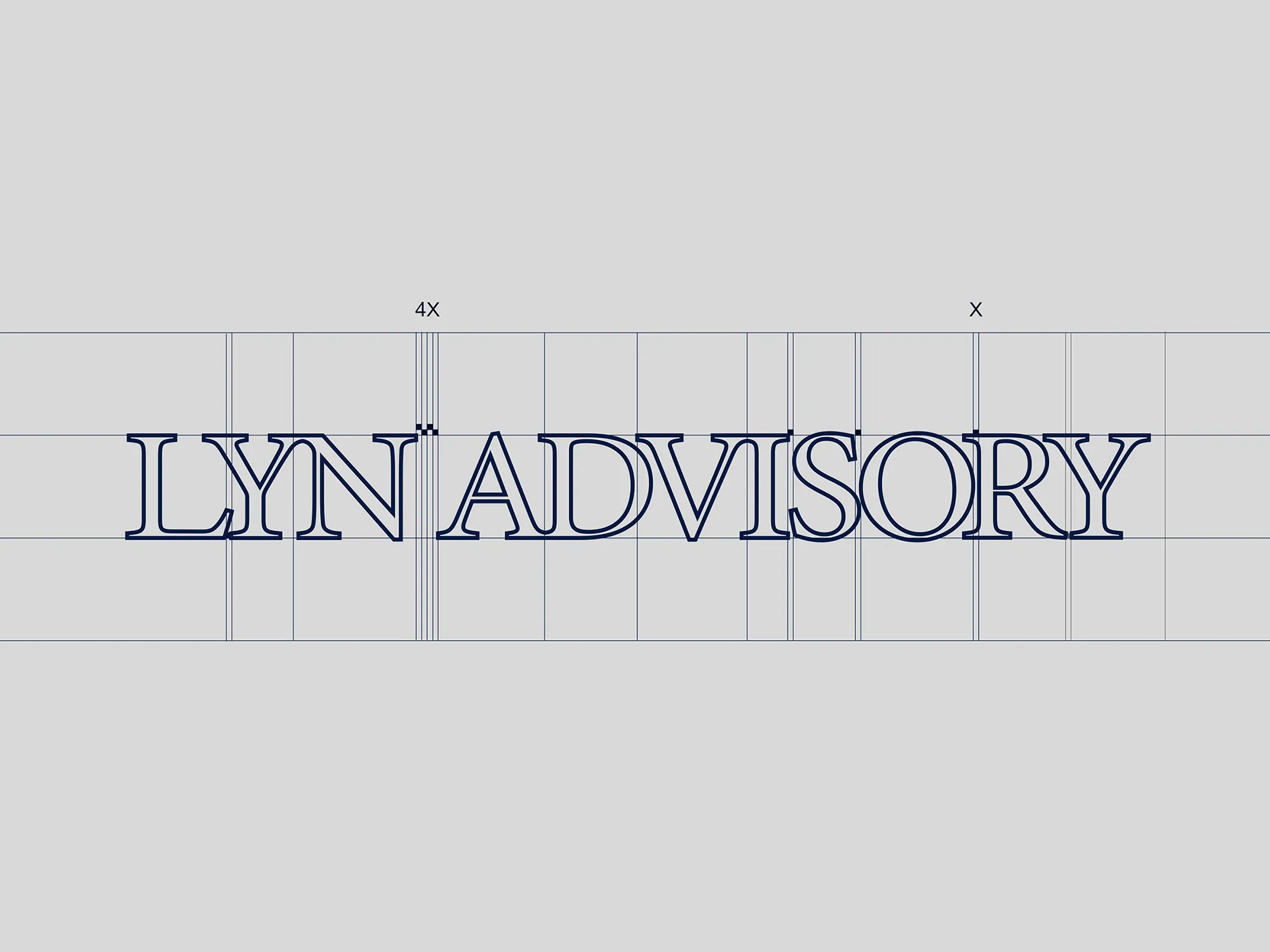
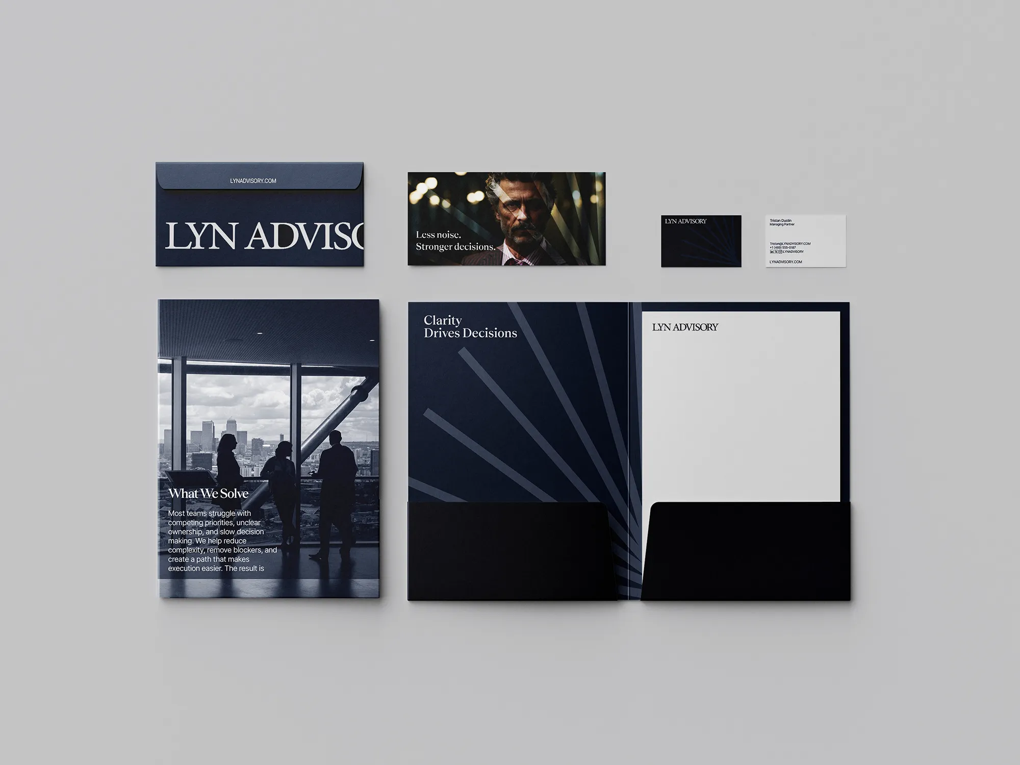
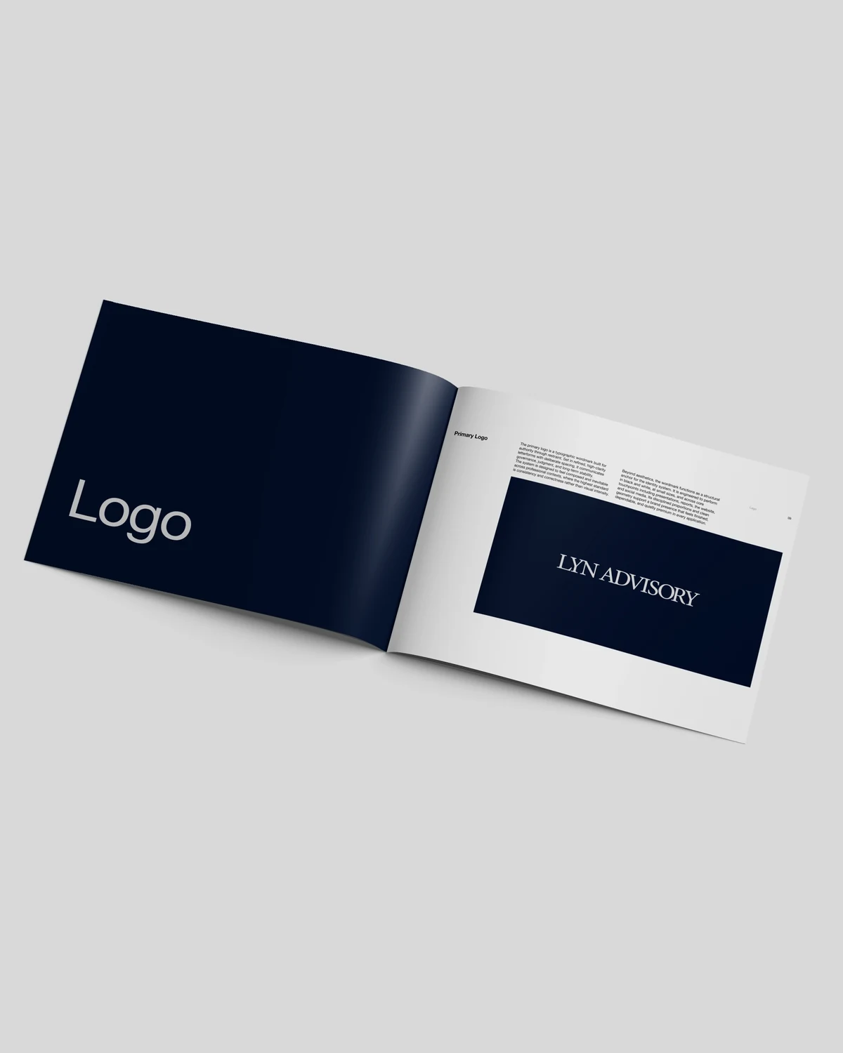
The wordmark is the anchor: LYN ADVISORY in refined serif capitals, with deliberate spacing and careful optical balance. Its construction is documented letter by letter on a grid, so the proportions are decisions, and it performs in document headers, footers and small digital placements.
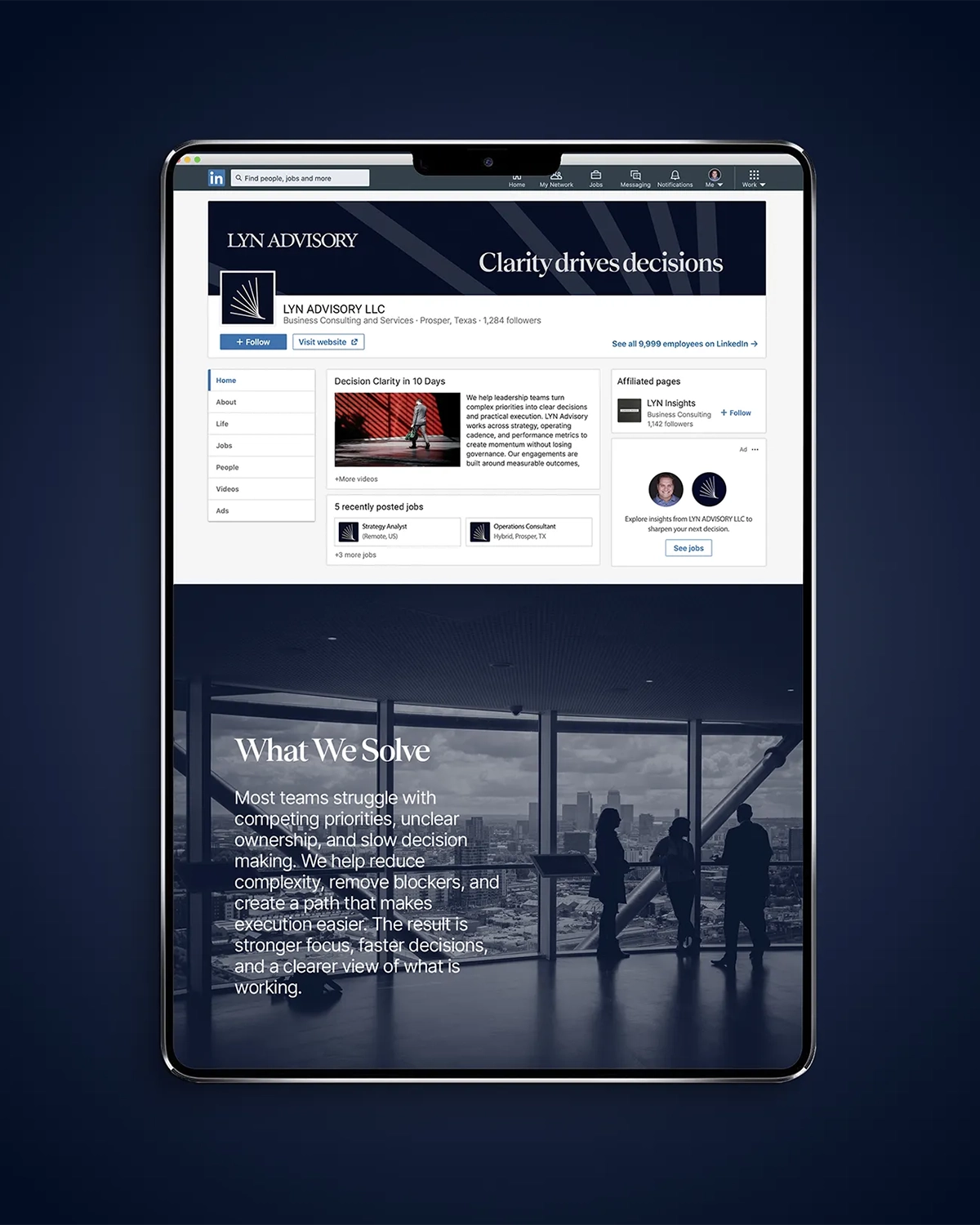
The mark earned its place. It is a fan of fine lines radiating from a single point, ending in a curved base: multiple forces aligned into one stable point and then unfolding with measured precision. It draws on no literal industry icon, so it says direction and scale and not consulting. It works where the wordmark cannot: the social avatar, the app icon, the presentation cover. At larger scales it appears tone on tone, navy on navy, quiet enough to read as structure and never louder than the type.
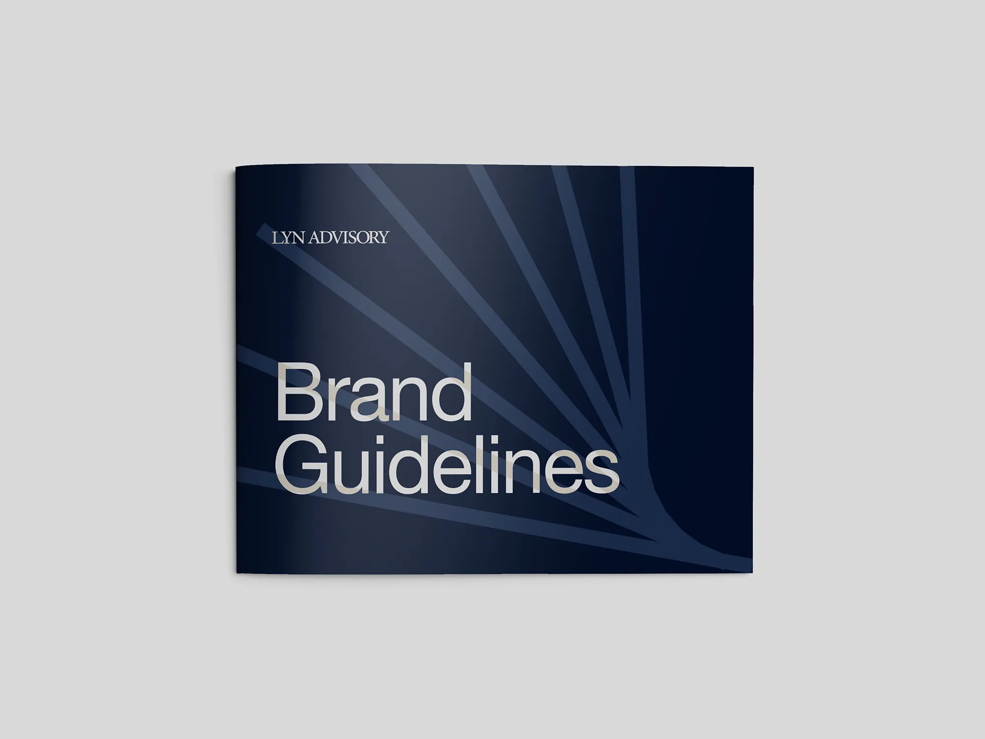
Rules keep both honest. The guidelines fix the minimum size, the clear space (the cap height of the wordmark, and the mark's own height on all sides), the approved logo-and-color combinations and the misuse cases: no stretching, no effects, no unapproved colors, no low-contrast pairings, no outlines and no rotation.
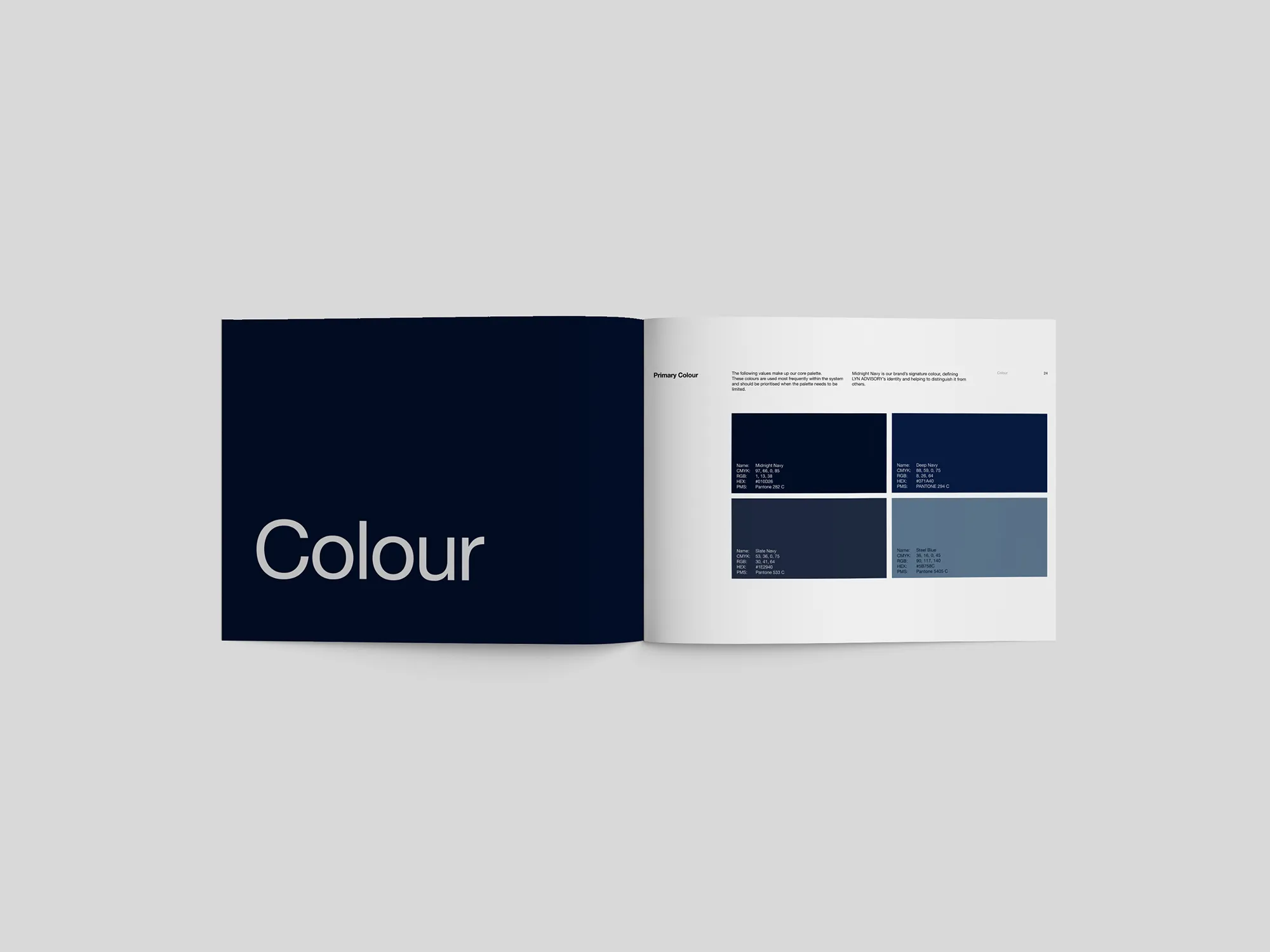
Color is a family of navies. Midnight Navy (#010D26) is the signature, with Deep Navy (#071A40), Slate Navy (#1E2940), Steel Blue (#5B758C) and Light Gray (#D9D9D9) around it, and Blue Slate (#314866) with a mid grey in support. Color supports hierarchy and navigation and is never used for mood, which is why the brand also holds in black and white.
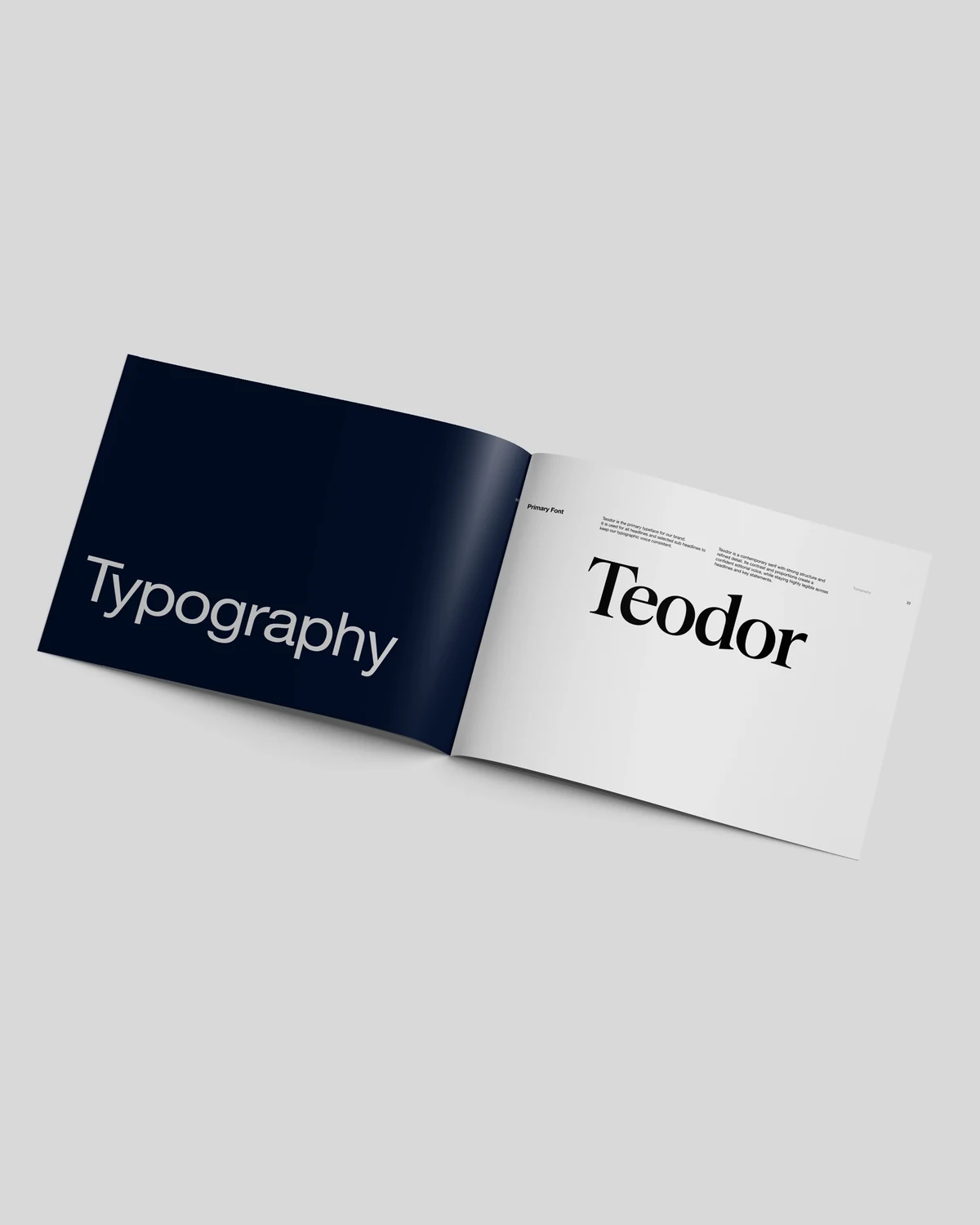
Typography uses two families with three weights in total. Teodor, a contemporary serif with strong structure, carries headlines in Medium and Regular. Inter, a neutral sans, carries body copy and interface text in a single Regular weight. Hierarchy comes from size, spacing and layout, and never from extra weights.






Before the DesignClick to download
LYN Advisory Brand Foundation: the eight-page strategy document that set the philosophy, principles and success criteria the identity was built to meet.
See the Discipline.Click to download
The Voice
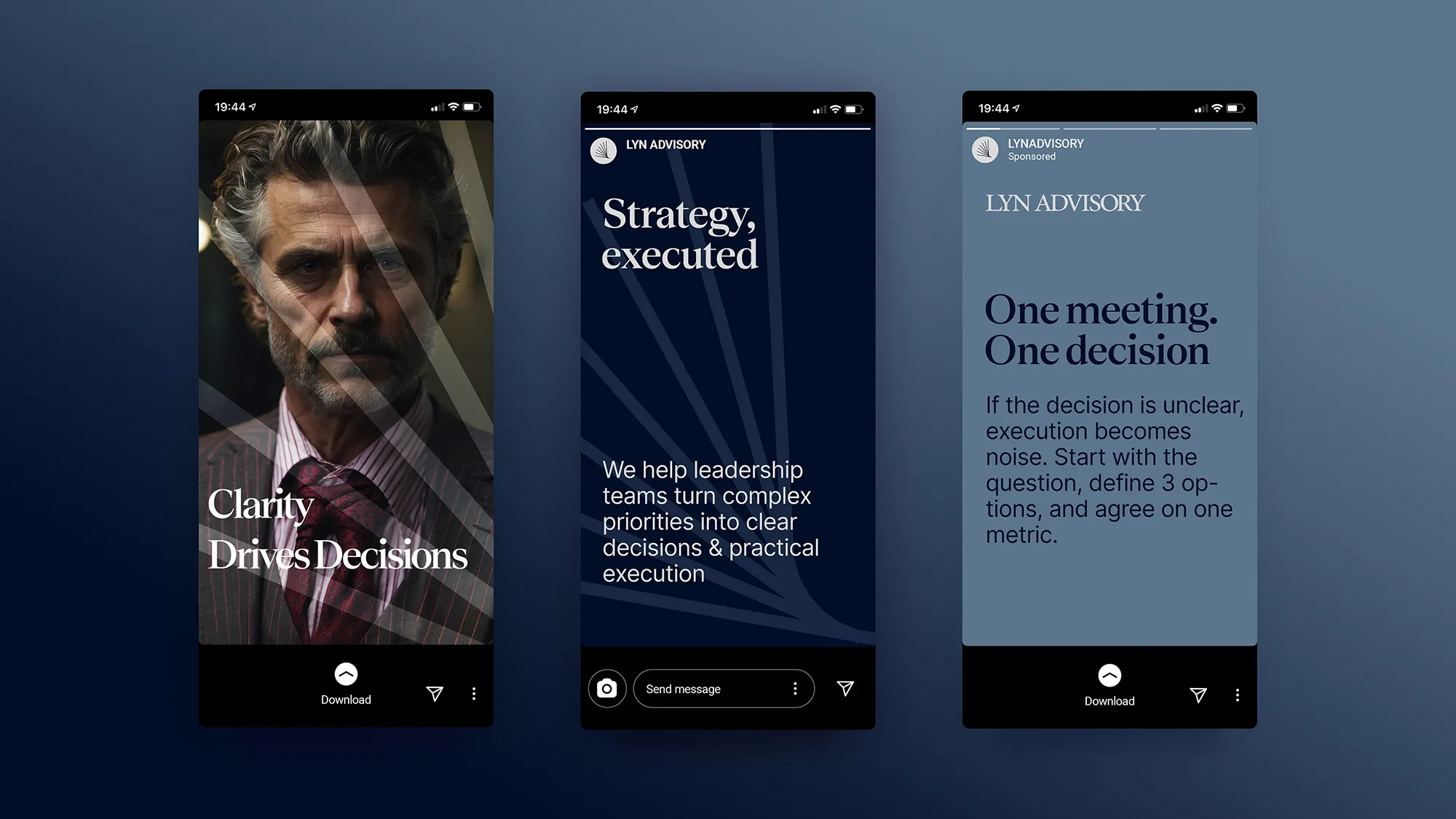
LYN Advisory speaks in short declarations followed by one plain sentence. Clarity drives decisions. Strategy, executed. One meeting. One decision. Each headline is followed by something concrete and usable: if the decision is unclear, execution becomes noise; start with the question, define three options, and agree on one metric.
The brand teaches instead of promoting. That is the voice of an adviser, and it keeps the identity honest to its own principle: credibility is assumed, so it does not need to shout.
Results
LYN Advisory now has a system, and not just a logo. The foundation set five success criteria: credible now and credible later, quietly strong in real use, restraint that reads as discipline, a complete system, and no forced elements. The guidelines turn each of them into rules a team can follow.
The result behaves like a well-built template library. The same wordmark, the same navy family and the same two typefaces appear on brand applications.
 Next projectSarah Sultan→Tailored to Last.
Have a project in mind?
Let’s talk about it.
Say hello