

Greenscapes:
Growth, by Design
A Brand Identity Built on Order, Reliability and Room to Grow
Greenscapes is a landscape company in Saudi Arabia, providing comprehensive solutions for residential and commercial outdoor spaces. It plans, builds and cares for gardens, which means its clients are hiring it for the years a space will be in use, not for a single day's work.


Our services
- Brand Identity
- Logo Design
- Visual System
- Stationery
- Signage
- Uniforms
- Digital Applications
The Context
Landscape branding speaks in one dialect: leaf icons, bright greens, sprouts and hand-drawn plants. They say nature clearly, and they say company not at all. A customer choosing a landscaper is choosing a contractor: someone to plan a space, build it, and keep it standing. For a homeowner it is a matter of trust in one's own property, and for a commercial client it is a matter of schedules, budgets and reliability.
The work is also physical. Greenscapes lives on crews, machinery, uniforms and signs, in sun, dust and distance. A mark that looks charming on a website but fades on a banner or a shirt does not serve it. The brief asked for an identity that moves beyond typical landscape visuals, and that communicates professionalism, structure and reliability.
The Challenge
How does a landscape company look like a professional firm, and not like a garden centre?
The identity had to be credible to commercial clients and approachable to homeowners. It had to leave the leaf-and-lawn clichés behind and still say landscape at a glance. And it had to be simple enough to embroider on a uniform and cut into signage, flexible enough to appear on black paper, white stationery and photography, and open enough to grow with the company.

Strategy
The thinking started from a plain observation: a landscape is nature that someone planned. The garden grows by weather, and the company is what gives it a plan. That is the promise we built the brand on: growth, by design.
Two rules followed. Draw the tree as a system, not as an illustration: parallel lines, one trunk, branches at a consistent angle, the geometry of a plan. And keep the green in the work, not in the logo. The gardens Greenscapes builds already supply the color, so the identity is free to carry the discipline behind them: charcoal, white and one quiet sage.
The result should read as a firm that measures, not a florist that decorates, and remain warm enough that an owner can imagine a garden at the end of it.

Design
The mark is a tree built from parallel bars. A central trunk rises through the circle, and angled bars branch from it on both sides, so that the space between the bars draws the form. It reads as a tree, a leaf or a growing plant, and it also reads as ruled lines on a drawing, which is where a landscape begins. The circle gives it a stable outline, so it works like a seal: on a favicon, a stamp or a shirt.
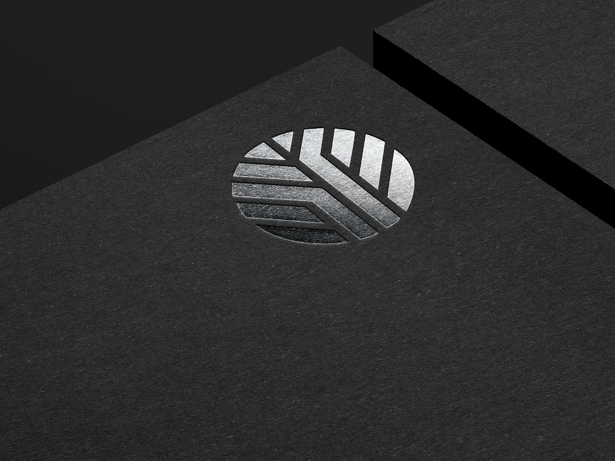
One color is enough. Because the negative space carries the shape, the mark holds in a single tone, whether black on a banner, white over photography, pressed into paper or finished in silver foil.
The wordmark sets greenscapes in lowercase, in a light geometric sans with generous spacing. It is calm and open, and it lets the mark carry the weight. The web address is set in the same style, so even the smallest line belongs to the system.
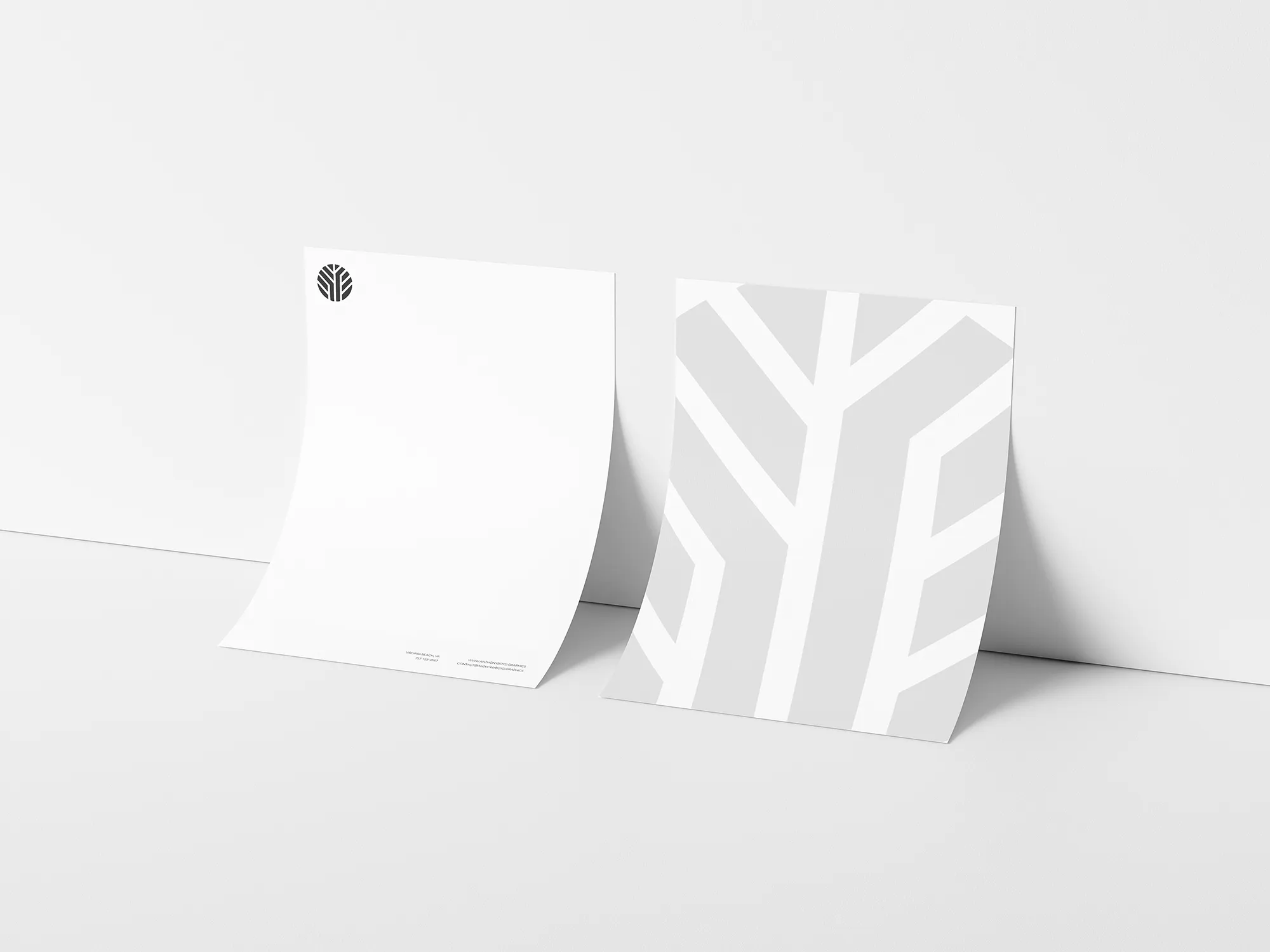
The branch pattern is the identity's second voice. The branches of the tree are enlarged past the page and cropped, in a pale tone on white, and appear quietly on the reverse of the letterhead and behind the plaque. It gives the identity a surface as well as a symbol.
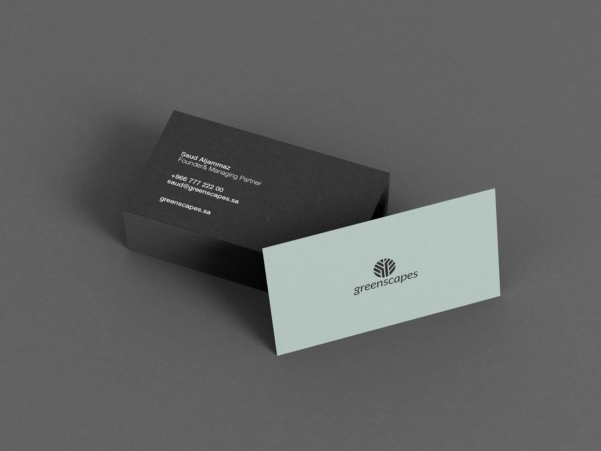
Color is drawn from what a landscape looks like from a distance: charcoal like shade, white like walls, soft greys like stone, and a muted sage, the color of foliage in shadow. Sage is the only nod to green, and it appears on a business card, kept quiet on purpose.
Typography is a single clean sans for everything, with hierarchy from size and spacing, and a bilingual greeting on the plaque set in matching weights.
Materials and finish carry the same restraint. The mark is pressed into thick charcoal stock and finished in silver foil, so a card feels precise before it is read.
Stationery applies the system to daily use: a white letterhead with the mark small in the corner and the address discreet at the foot, and business cards in two colorways, charcoal with white type and sage with the mark and name.
Signage and uniforms take it outdoors. A hanging banner under a louvred pergola carries the mark large in black with the address beneath it, and an acrylic plaque carries the pattern and a greeting in Arabic and English. On photography, the mark appears in white over a gardener at work, so the campaign shows the people who do the work.
The Voice
Greenscapes speaks like a project manager who loves plants: practical first, warm second. It names the work plainly: what will be built, how it will look and how it will be kept.
It avoids the pastoral vocabulary the category leans on, because the brand's promise is reliability, and a promise of reliability is made in specific words. Arabic and English sit side by side with the same tone and the same weight.
Results
Greenscapes now reads as a firm with structure. The mark works in black on a banner, in foil on a card and in white over photography, and the same circle, the same bars and the same quiet palette appear on stationery, signage and imagery.
The identity supports the brand's positioning with commercial and residential clients alike, and it is built for long-term growth. A tree is a form that grows, and the system leaves room for that: new services, new crews and new materials can join it without redrawing the mark.

Have a project in mind?
Let’s talk about it.
Say hello