
ARADY:
Land, Made Clear
A Brand Identity Built on Simplicity,
Usability and Digital-First Design
ARADY is a real estate platform in Qatar, built to bring clarity and transparency to land pricing. Its name is the Arabic word for “lands,” and its promise is that a buyer should be able to see what land is really worth.

Where It Lives at arady.qa

Our services
- Brand Identity
- Logo Design
- Visual System
- Digital-First Application
- Marketing Materials
- Brand Guidelines
The Context
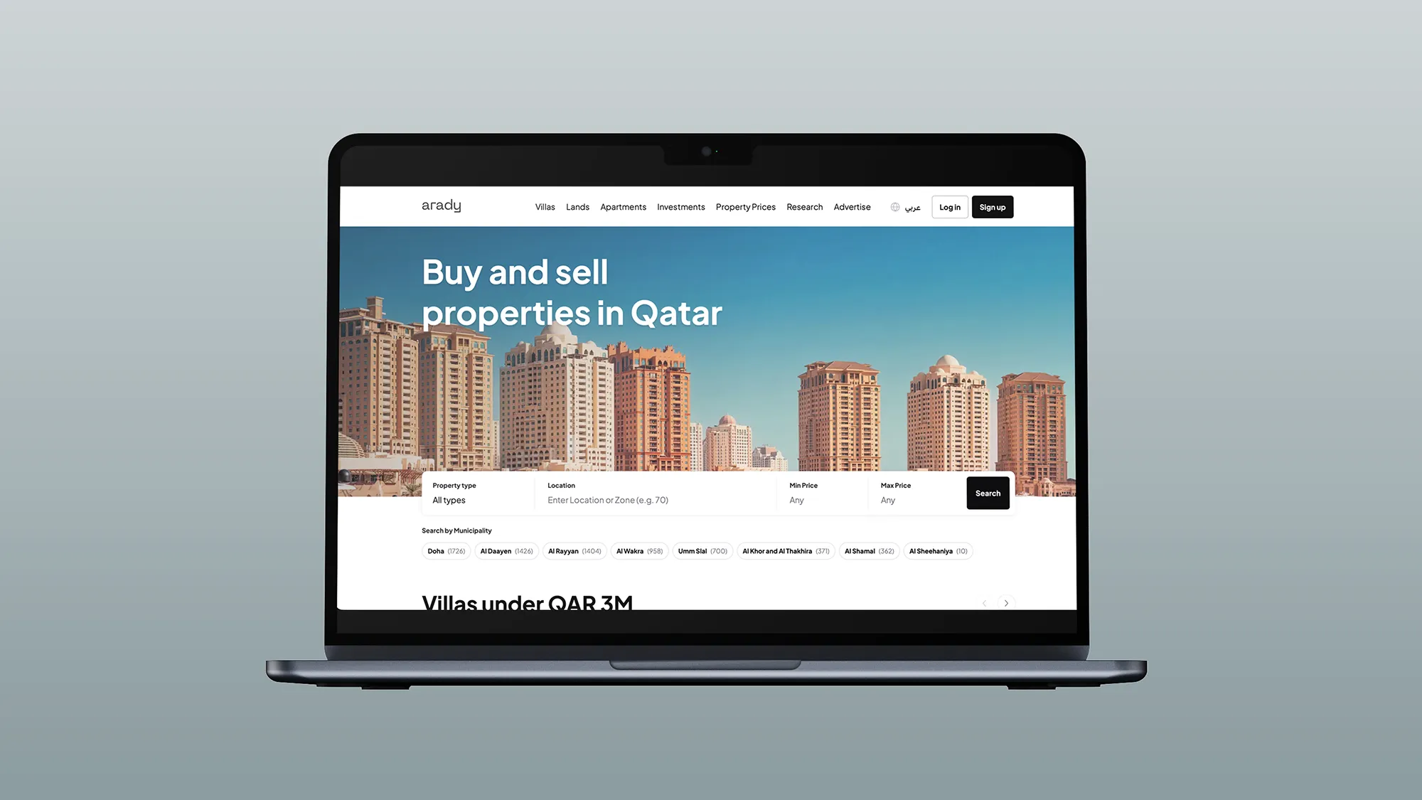
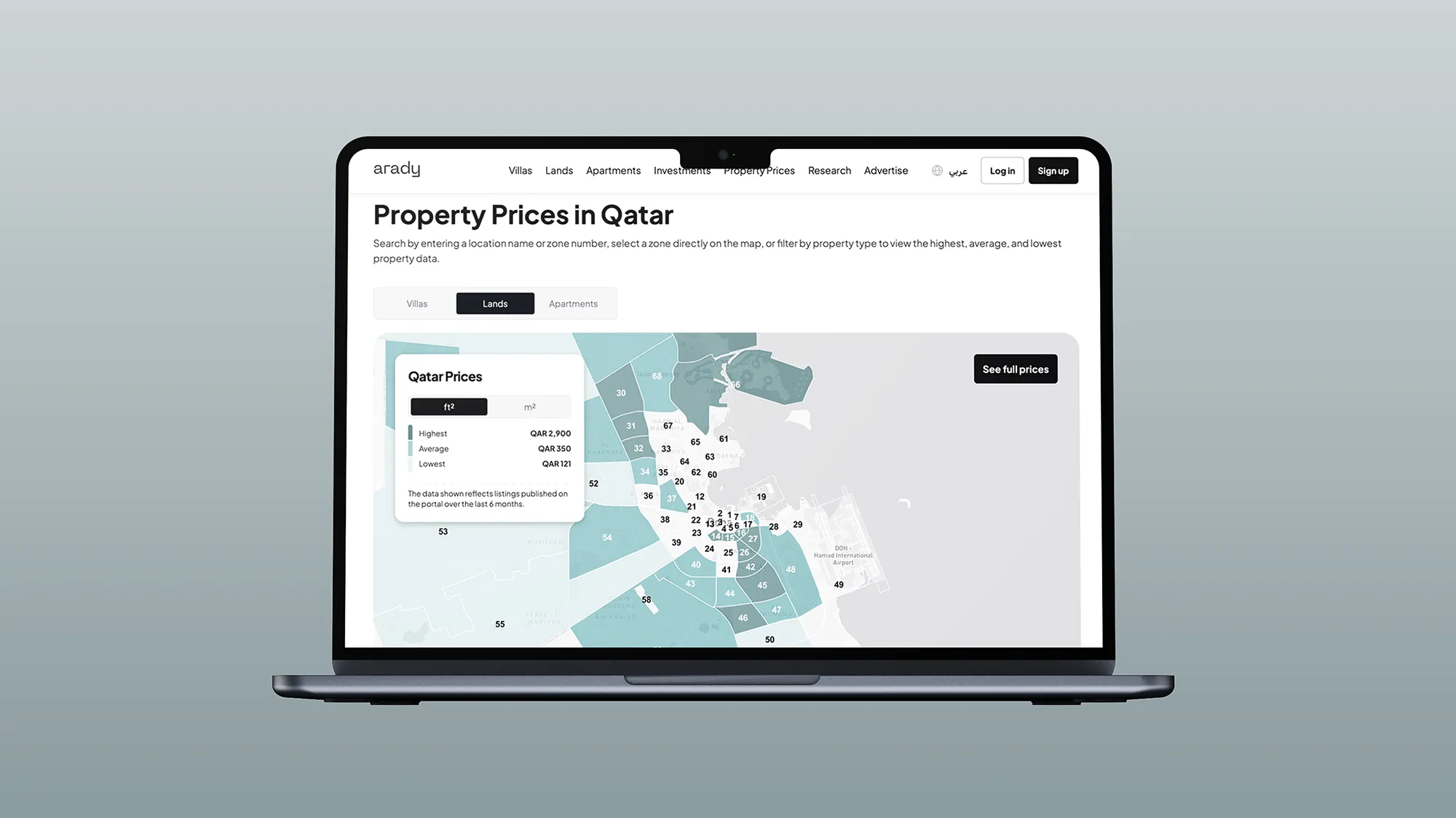
Buying land in Qatar has long meant comparing prices scattered across brokers, advertisements and conversations. Listings present price and area in different ways, and a buyer who wants to compare two plots has to do the arithmetic alone.
ARADY brings the market into one place, with land for sale, land prices and market news gathered on a single platform. The product is already about transparency. The brand had to make that transparency feel effortless.
The Challenge
How does a brand look transparent, when it lives on screens full of numbers, photographs and filters?
A property platform is a working product, and the identity lives inside it. It had to support the data instead of competing with it: sit quietly in a header, on a phone and on a small icon, and still be recognisable. It had to work in Arabic and English, and on light backgrounds, dark ones and photography. And it had to feel trustworthy without feeling bureaucratic, and modern without looking like every other property portal.
Strategy
We summarized the ambition in one sentence: land, made clear.
The category tends to split in two: official-looking registries that feel distant, and crowded classifieds that feel noisy. We placed ARADY between them: credible and open, serious about the numbers and easy to approach.
That sentence also gave the identity its rule. The brand should behave like the product: show less, and make what remains unmistakable. Everything unnecessary was removed, until what was left could be read in an instant.
We designed from the screen outward. The identity started from the smallest and most frequent moments, the header and the icon, and then grew into the wider system and the marketing materials. A digital-first identity has to prove itself at thumbnail size before it is asked to fill a billboard. And the category leans on the same imagery: rooftops, keys and location pins. We set these aside, so that ARADY looks like a source of information, and it does not look like an advertisement for property.
Design
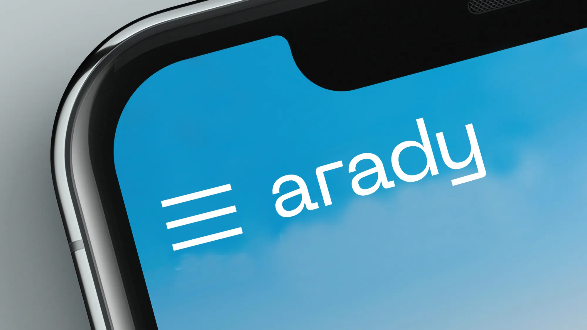
The wordmark is set in lowercase, in a rounded geometric sans: arady. Lowercase makes it friendly and approachable, and the open, even letters read cleanly at any size on any screen. The tail of the y ends in a squared corner, a small detail that gives the mark its character, and lets it be recognised even when it is small. It works in white over photography and in dark on light backgrounds.
Color is built on restraint. A single deep burgundy is the brand's accent, set against white and neutral surfaces. Because it is used sparingly, it carries weight wherever it appears. The palette stays quiet enough to let the numbers and the land lead, and the burgundy gives the brand a distinct, warm voice in a category dominated by blues and greens.
Typography follows the same logic. The supporting typeface is neutral and highly legible, chosen so that prices and figures read cleanly at every size, and it stays out of the way of the wordmark's character.
The digital-first application is where the identity earns its place. The wordmark and its rules were tested at the sizes where it lives most: a phone header, a small icon and a narrow screen. Clear space, colors and minimum sizes were set so that it holds up at every scale, in Arabic and in English.
Marketing materials apply the same rules outside the product: the same wordmark, the same single accent color and the same restraint. The promise made in an advertisement matches the experience in the product, so the brand feels like one thing everywhere.
The Voice
ARADY speaks like a knowledgeable, honest advisor: plain, factual and helpful. It names the thing directly and states the figure, and it leaves out the adjectives.
Claims are short and specific, and the numbers around them give them weight. In a brand built on transparency, the tone should demonstrate what it promises.
Results
The identity clearly expresses what ARADY stands for. It is clean, modern and easy to use, and it supports trust and data accessibility at every point where a buyer meets the brand.
The same system runs across the platform and the marketing materials, so the experience feels consistent from the first impression to the last. Because the rules were built for a digital product, they scale with it: a new section, a new campaign or a new format can join the system without breaking it.
 Next projectWensah→Good Company, Delivered.
Have a project in mind?
Let’s talk about it.
Say hello