
Abdulla Murad:
Leadership, Distilled
A Rebrand Built on Authority, Clarity and Long-Term Positioning
Abdulla Murad is a leadership coaching firm in Kuwait, founded to develop leaders across the Arab world through coaching, training and mentoring. Its clients are CEOs, founders, managers and entrepreneurs, and the one thing the firm cannot do without is their trust.

Our services
- Brand Identity
- Logo Redesign
- Visual System
- Stationery
- Corporate Materials
- Signage
The Context
Leadership coaching is a business of confidence. A chief executive who invites a coach into the room is handing over private questions about decisions, people and doubt. That trust forms early, and much of it forms through what a prospective client sees first: a logo, a card, a page, a signature.
The firm's practice brings together leadership, coaching and psychology. It has coached more than 100 leaders, trained more than 500 and delivered over 1,000 hours of leadership development. It works in Arabic first and English second, and its clients read both.
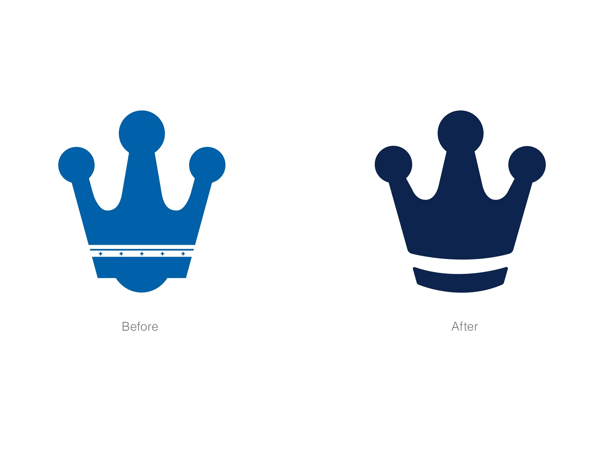
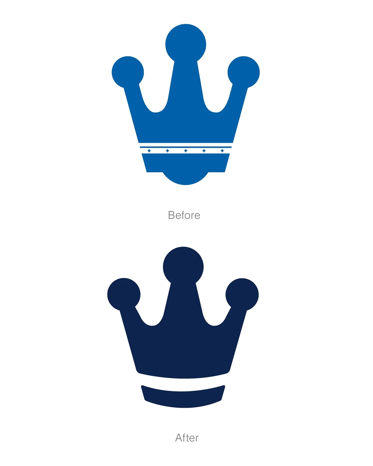
Its earlier identity was built around a crown, a natural symbol for leadership that clients already knew. The idea was right, but the drawing was busy: a bright mid-blue, a decorative band of five small stars and a heavy rounded base. It carried the detailing of a badge, where a senior advisory practice needed the calm of a signature.
The Challenge
How do you refine a symbol clients already recognise, without losing the recognition?
And how does a coach's brand carry authority without looking royal? A crown says leadership, but it can also say hierarchy, ornament and heraldry, which is the opposite of a practice built on helping others lead. The mark had to keep the idea and drop the costume, in Arabic and English, and it had to hold from a business card to the entrance of a building.

Strategy
We described the idea as leadership, distilled: keep what is essential and remove the rest. In practice it became three moves: keep, simplify, structure.
Keep the crown, because it is the firm's most recognisable asset and it means what the firm does. Simplify it, removing every detail that decorates and none that define. Structure it, rebuilding the shape on measured geometry so that its proportions are decisions and not habits.
The same discipline runs through the whole system. The firm helps leaders turn clarity into results, and the identity follows the same order: clarity first, then the application. That is why the brand can speak in an equation: successful leadership = achieving results.
Design
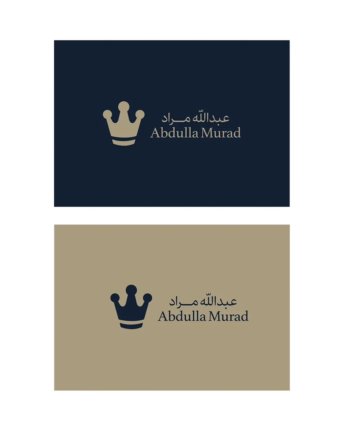
The mark is the same crown, distilled. The five stars and the ornamental band are gone. The three round finials remain, joined by tapered tines and a broad, solid body. The base band is set free from the crown and floats beneath it as a curved bar, which gives the mark a firm footing and a cleaner silhouette. The mid-blue is replaced by a deep navy.
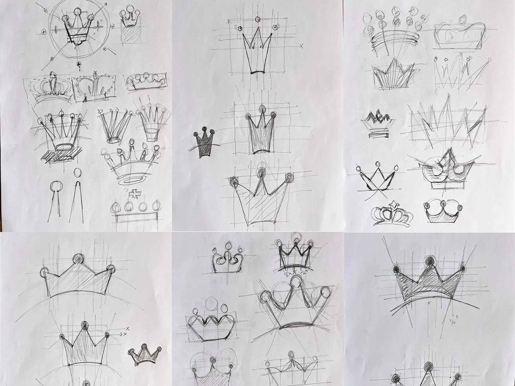
The construction is visible in the working drawings. Pages of hand sketches explored crowns of every kind, from heraldic to geometric to minimal, before the final form was drawn over a grid of circles and a golden-ratio spiral. The three finials are circles, the curves follow the spiral, and the whole mark sits within a circle. The geometry does not show in the finished logo, but it is felt as balance.
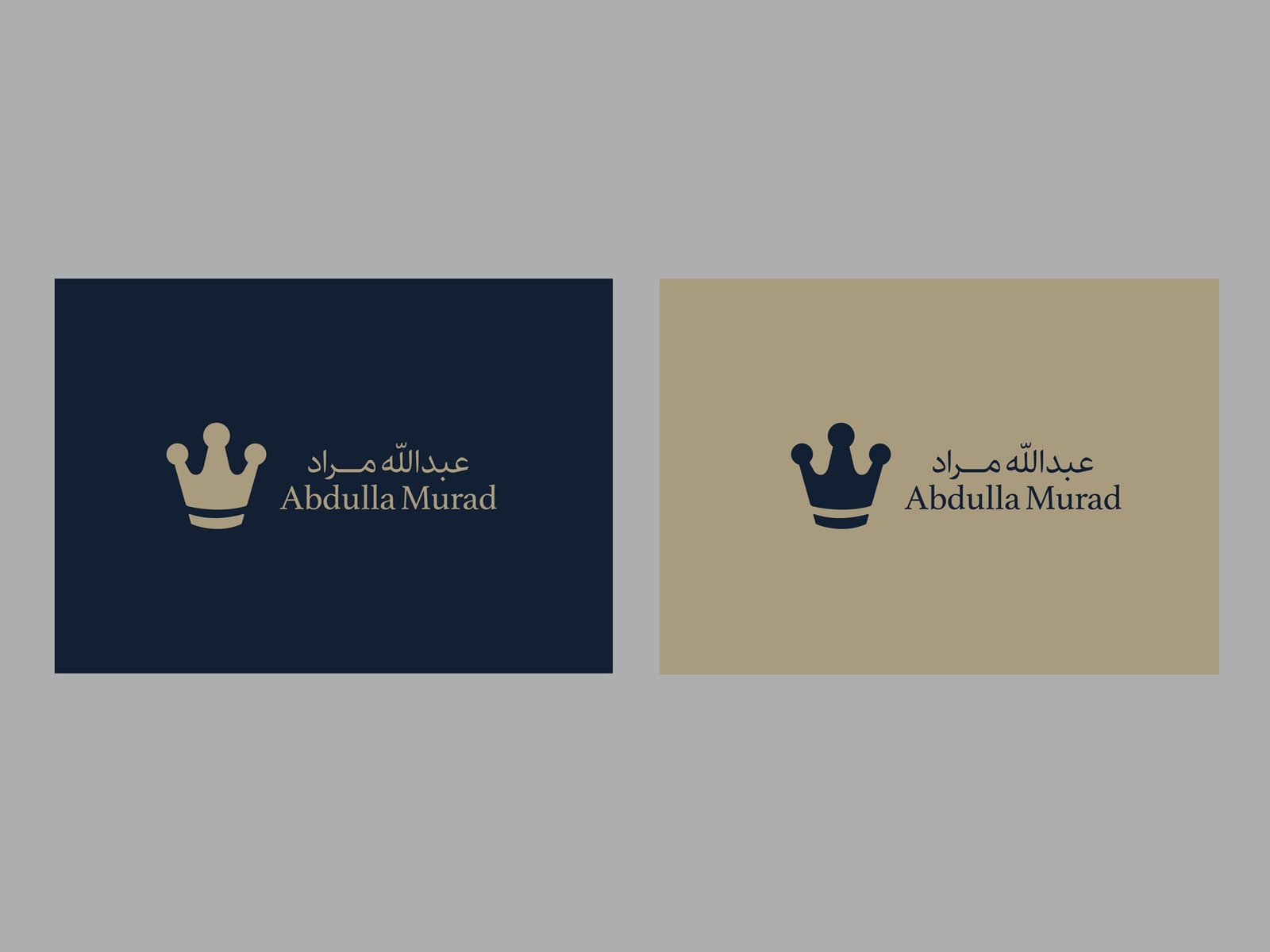
The name lockup places the Arabic name above the Latin one. The Arabic is set in a modern style with an elongated connector in Murad, and the Latin in a refined serif with tall, calm proportions. The crown sits beside the name in the horizontal lockup, and stands alone, small, as a seal in the corner of a plaque or a cover.
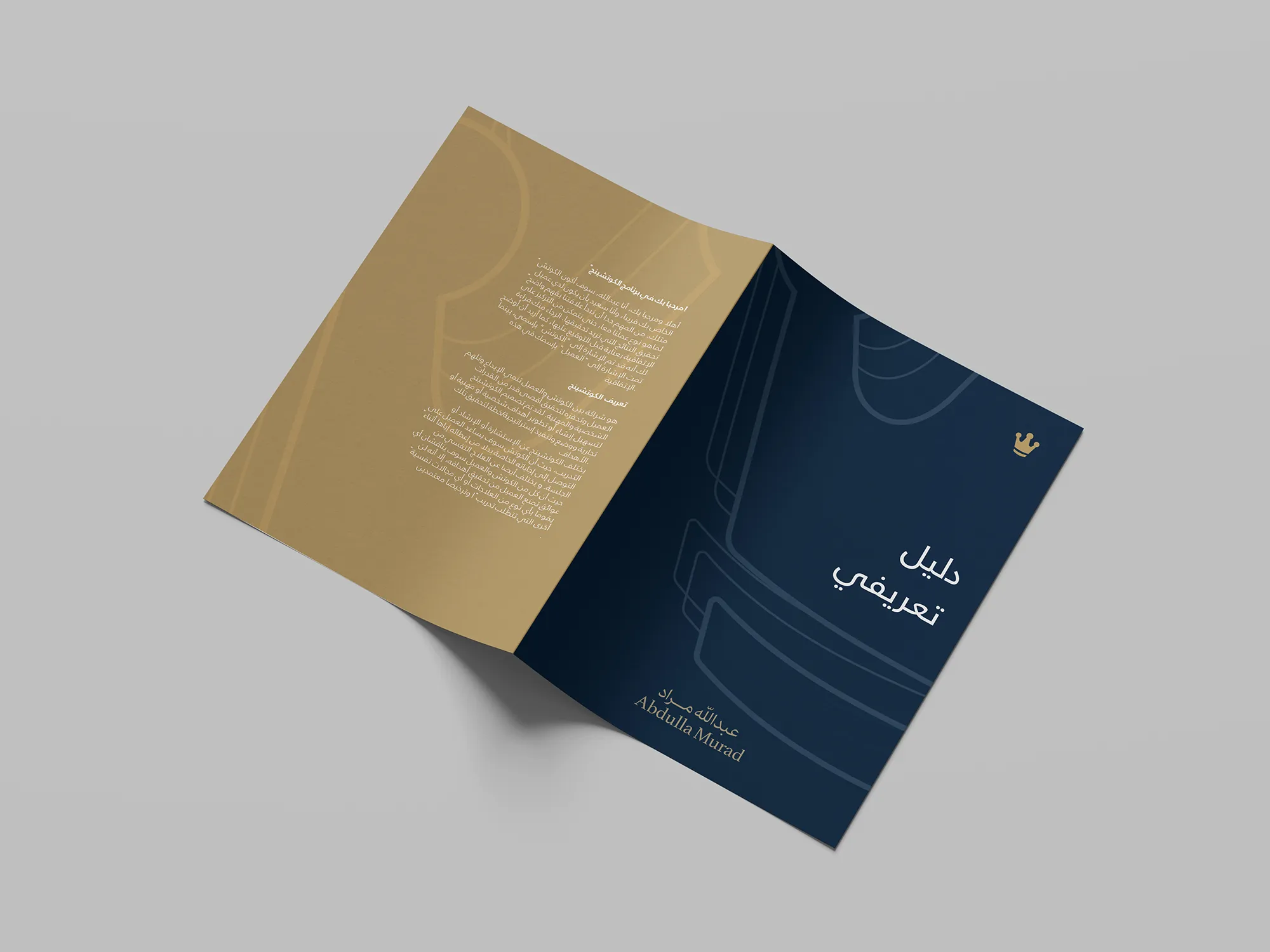
Color is built from three tones. A deep navy carries authority and depth. A warm, matte sand-gold replaces the shine of bright gold, and a soft cream serves as paper. On navy the crown appears in sand-gold, and on cream it appears in navy.
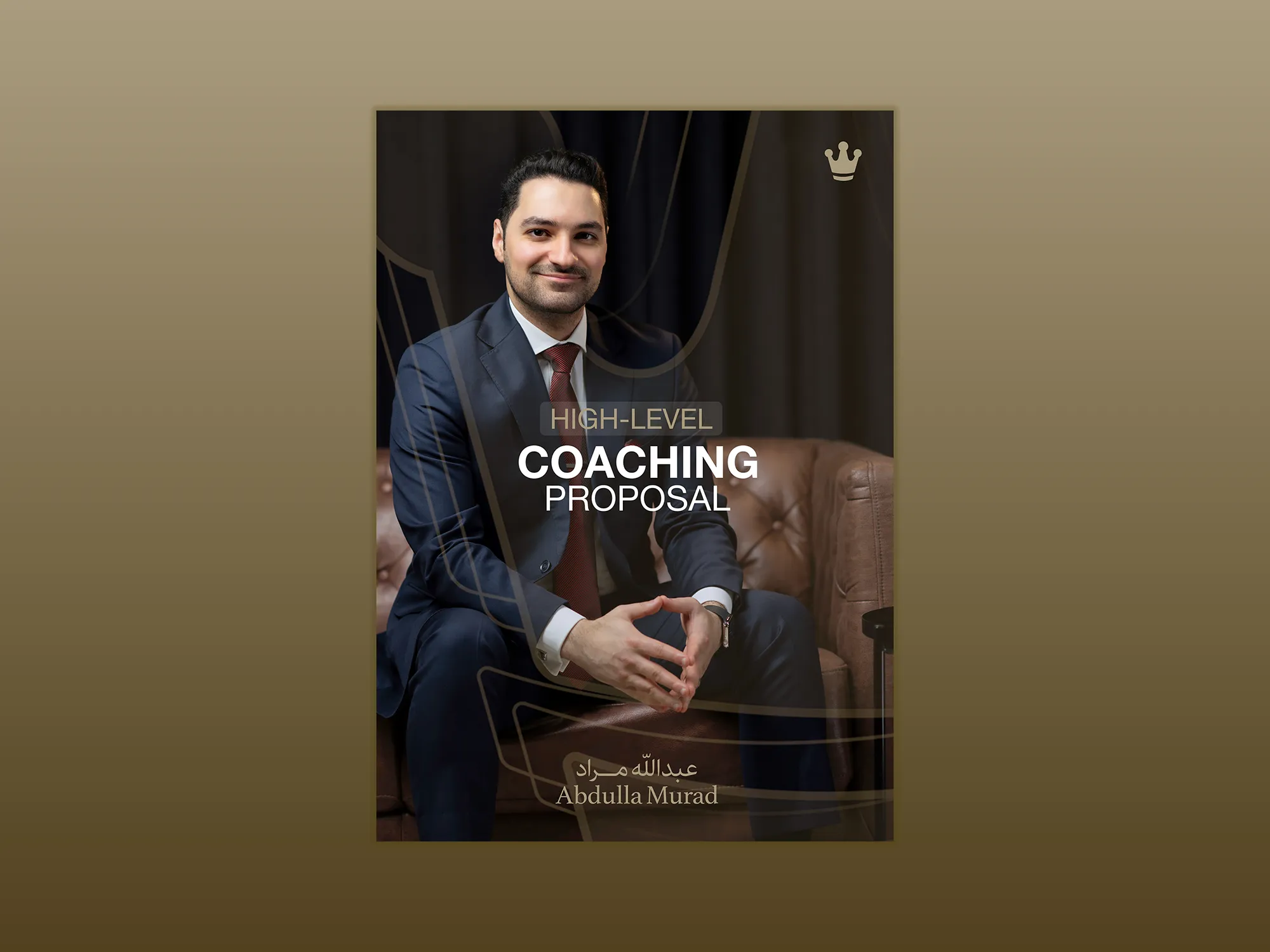
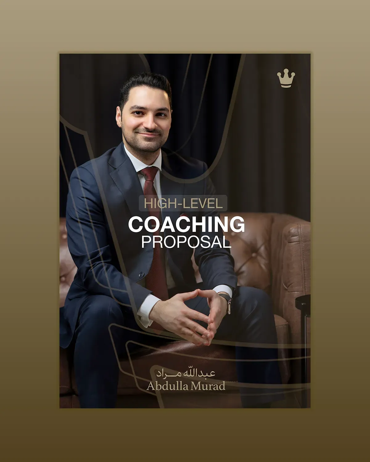
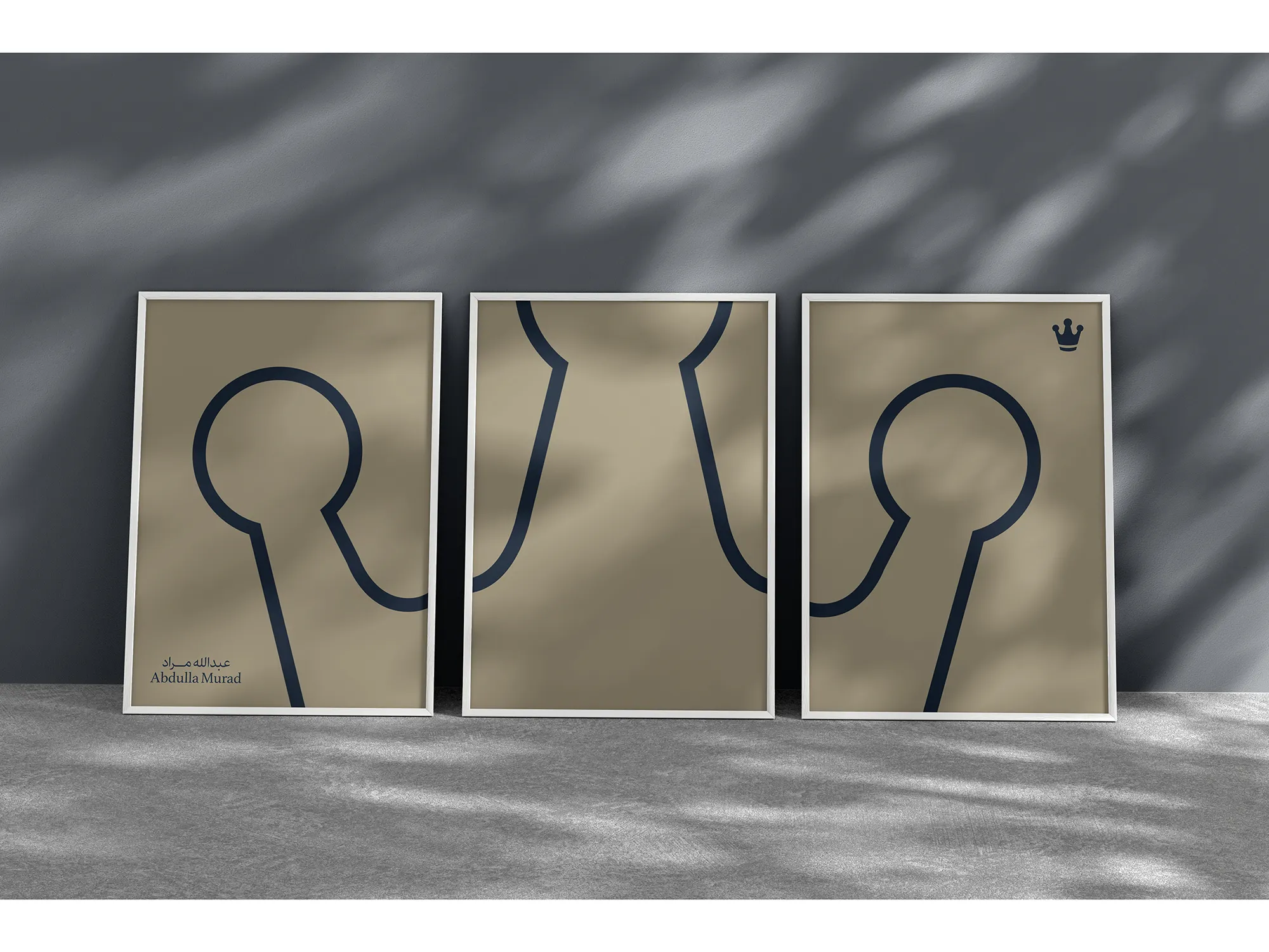
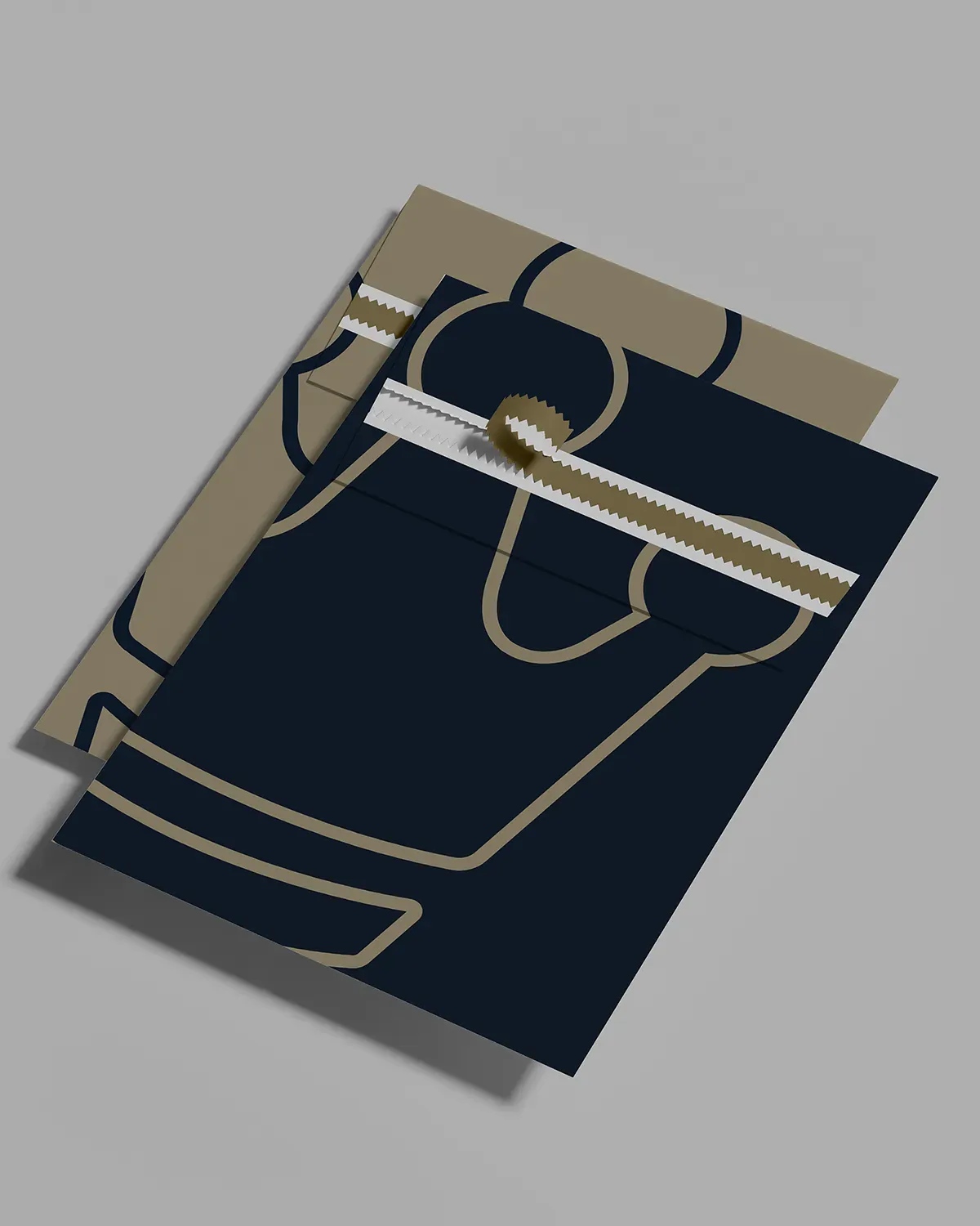
The line pattern gives the identity a texture. Large outlined shapes drawn from the crown's own curves are enlarged and cropped into an abstract pattern. It sits quietly behind text on covers and brochures, and stands alone on framed prints.
Typography lets Arabic lead. Arabic headlines are set large and light, and the Latin serif is reserved for the name.
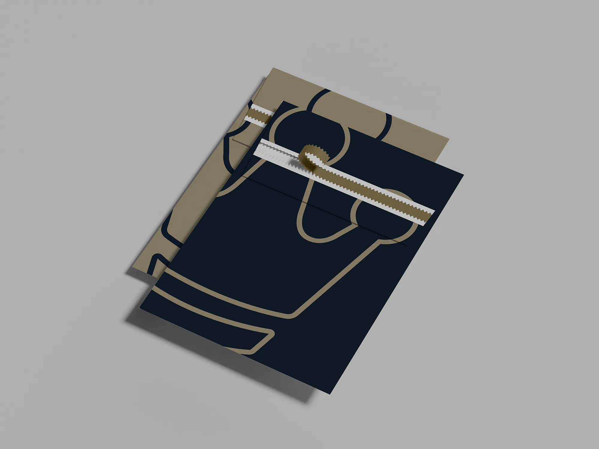
Stationery carries the system into daily use. The business card has a navy face with the crown and name in a tonal foil pressed into a textured stock, and a cream face with the line pattern. The envelope, the invitation and the printed pages follow, on navy and sand-coloured stock, with Arabic set as the main language.
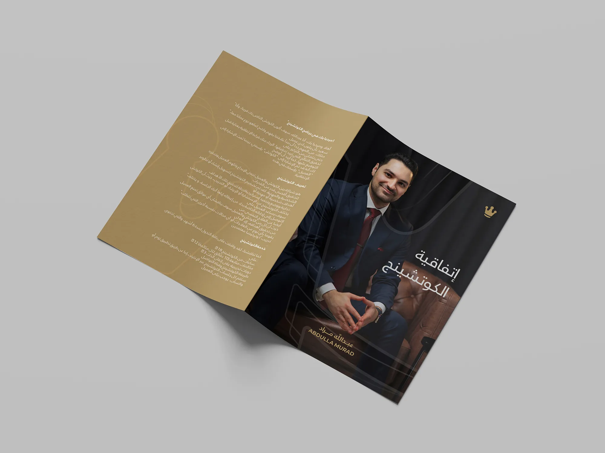
Corporate materials extend it further: a company profile with a navy cover and a sand-gold interior, and a navy folder with a serrated seal. Signage brings the mark to the building: a navy panel at the entrance and an acrylic wall plaque, each with the crown small in a corner and the name at the foot.


The Voice
Abdulla Murad speaks like a coach who knows that the job is to clarify, and not to impress. It is direct, warm and structured, and it addresses the leader as a peer, never as a pupil.
That choice is tied to the crown itself. A brand whose symbol is a crown could be read from above, so the tone balances it: short sentences without condescension, and specific promises without exaggeration. The equation is its favorite form, القيادة الناجحة = تحقيق النتائج (“successful leadership equals achieving results”), because it puts the whole idea in one line and leaves the reader nothing to guess.
Arabic is the language of origin, and English follows with the same weight and clarity. There is no borrowed jargon and no motivational fervor. A busy chief executive needs a clear idea, and does not need a speech.
Results
The rebrand gives Abdulla Murad a mark that a senior client can take seriously, and a system that holds together. The crown is still recognisable, but calmer and more precise, and the before-and-after comparison shows how much was removed to get there.
The same navy, the same sand-gold and the same restraint appear on a card, a brochure, a folder and a sign, which reinforces authority and professionalism at every touchpoint. Because the mark is built on geometry and not on fashion, it is designed to last: a positioning for the long term, with a pattern that leaves room to grow.
 Next projectARADY→Land, Made Clear.
Have a project in mind?
Let’s talk about it.
Say hello